
Murusa
End-to-end Mobile App Design
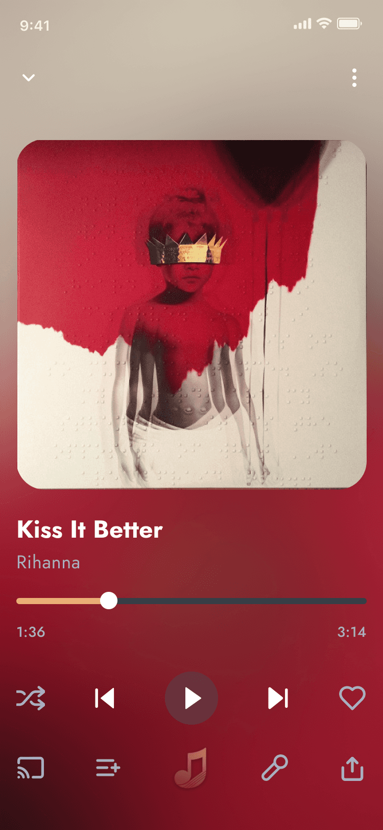
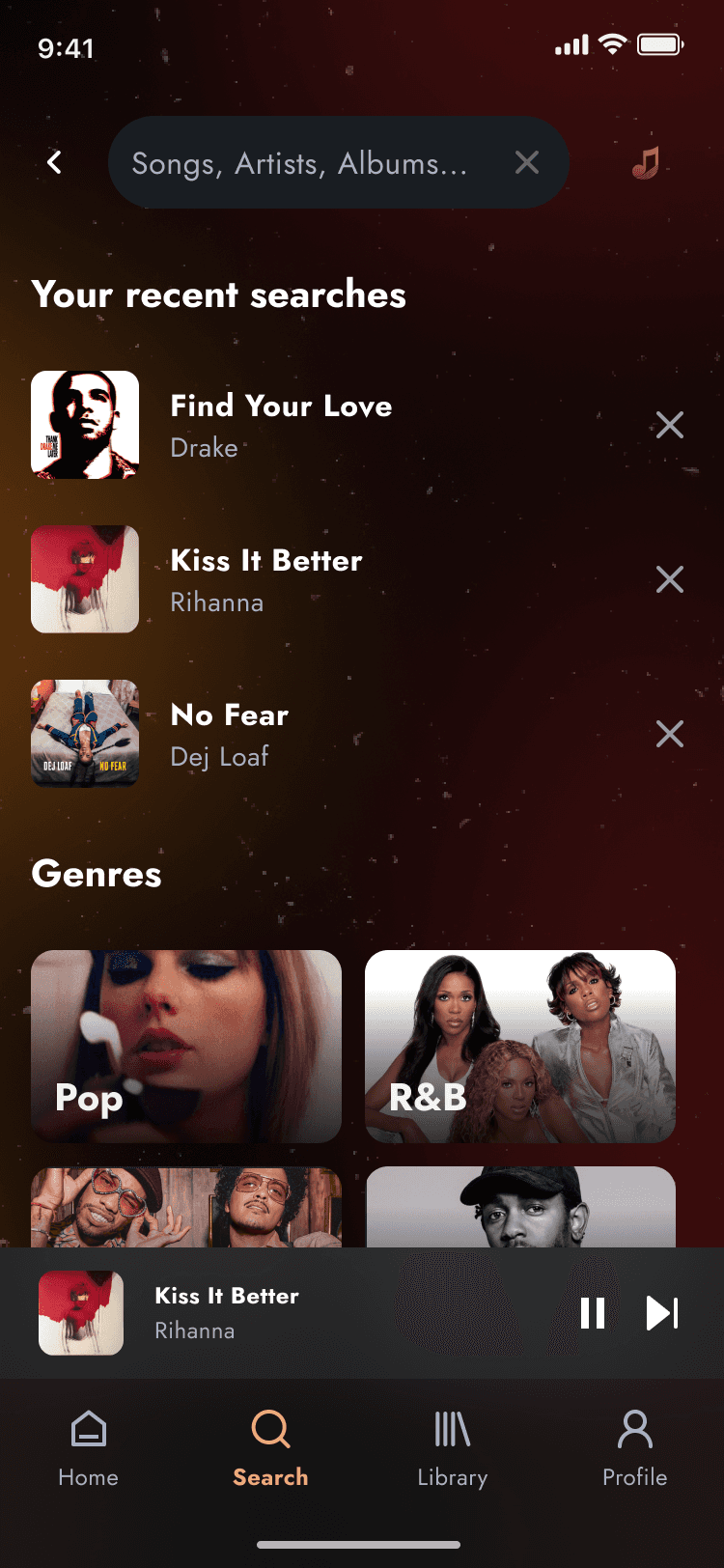
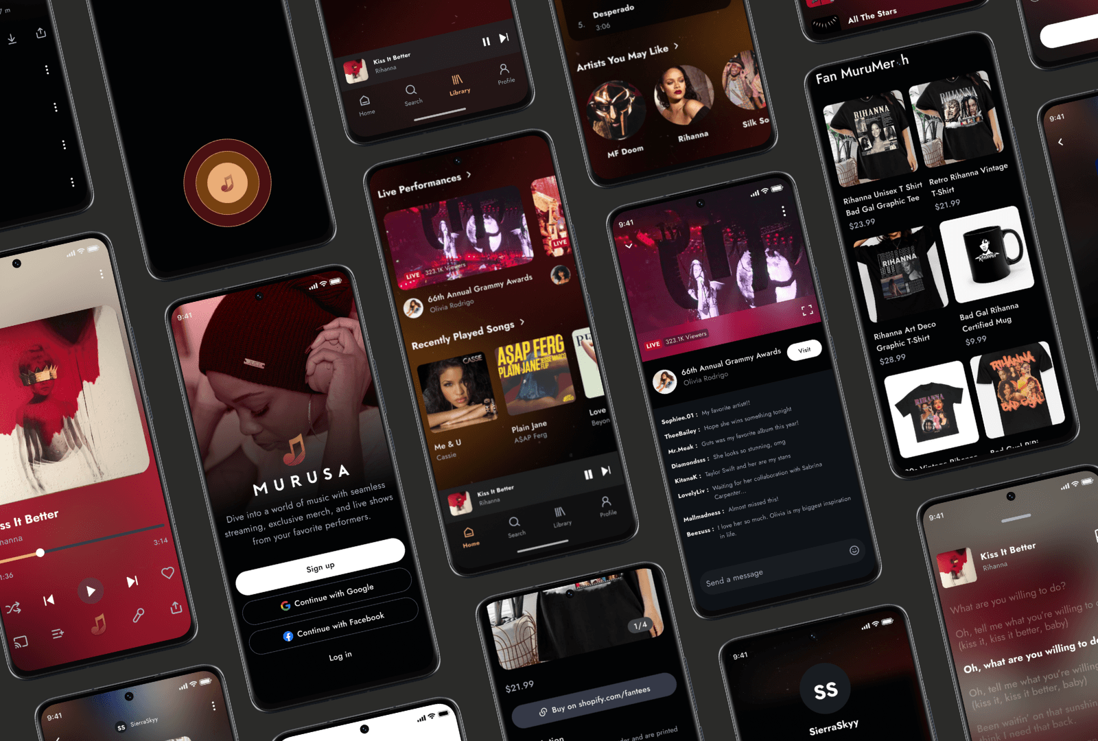
Murusa is a mobile app that lets users stream music, buy artist merch, watch live shows, and explore upcoming tours—all from one convenient platform.
Background
This is a freelance project I inquired after a client reached out to me through a networking event.
Tools
Figma, Signify, Adobe Creative Suite, Midjourney
Role
UI/UX Designer, Brand Development, UX Research, Wireframing, Prototyping
Duration
8 weeks: June 2023 - July 2023
Research & Analysis
Ideation
Design
Test & Refine

RESEARCH & ANALYSIS
What is the goal?
How might we create a music platform that streamlines access to streaming, merchandise, live shows, and tour information while enhancing artist-fan engagement and ensuring effortless music discovery?
The Problem?
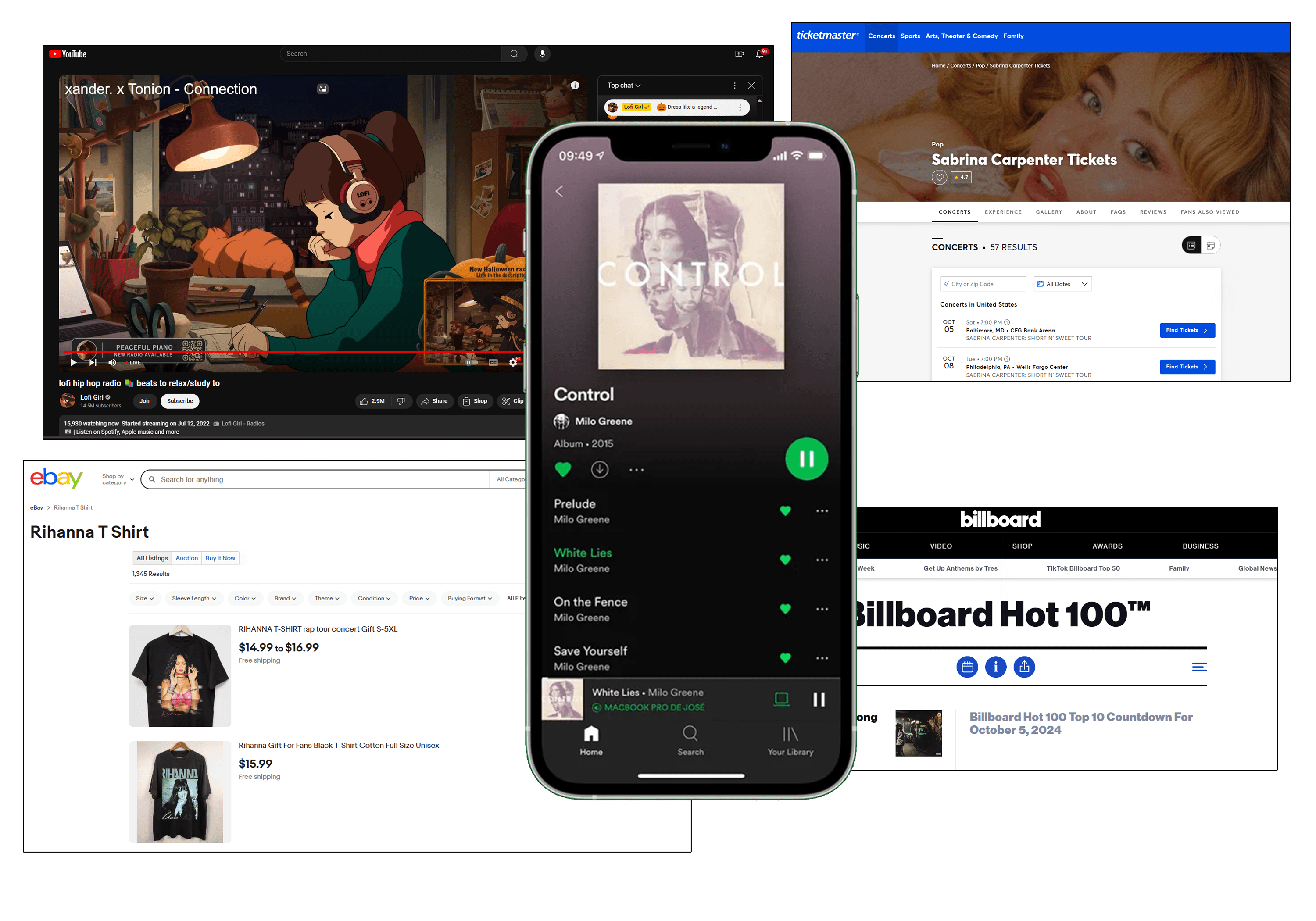
Yes, while apps like Spotify and Apple Music provide streaming services, music enthusiasts want a more integrated experience.
In order to...
➼ find exclusive artist merch, they have to visit various e-commerce sites,
➼ stream live performances, they need to navigate separate platforms,
➼ explore upcoming tours, they rely on multiple event pages,
➼ discover new music, they often search through social media or various apps,
...and so on.
This fragmented experience not only wastes valuable time but also detracts from the overall enjoyment of engaging with their favorite artists and discovering new music.
What the current user experience looks like…..
RESEARCH & ANALYSIS
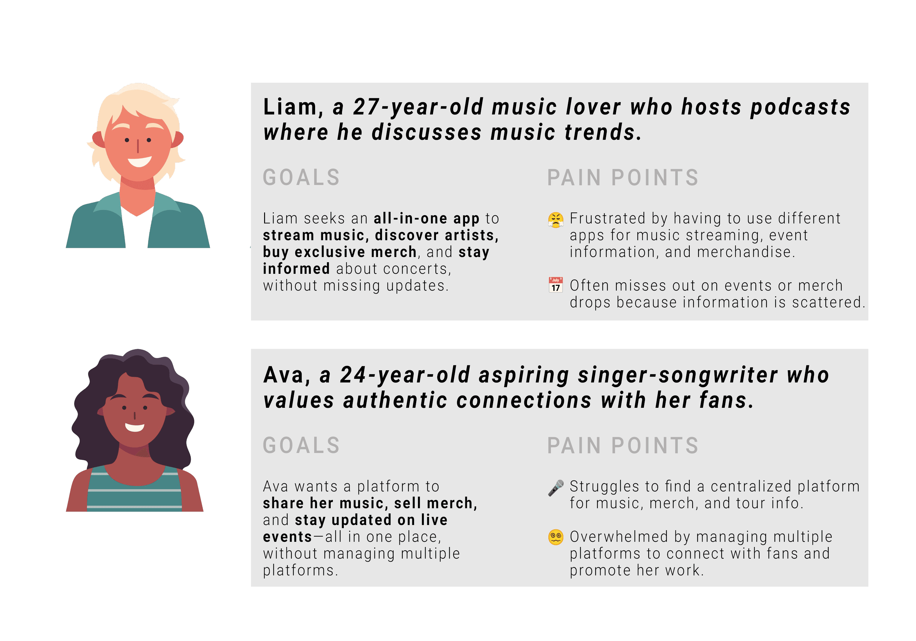
Research-Backed Personas
To gain a deeper understanding of Murusa's target audience, I conducted research through surveys and in-person conversations with musicians. This helped me uncover their preferences, challenges, and behaviors, which informed the creation of user personas that accurately represent the needs and desires of Murusa’s users.
These personas were necessary to understanding what music lovers really want, helping me design Murusa to perfectly fit their needs and make their experience seamless and exciting.
RESEARCH & ANALYSIS
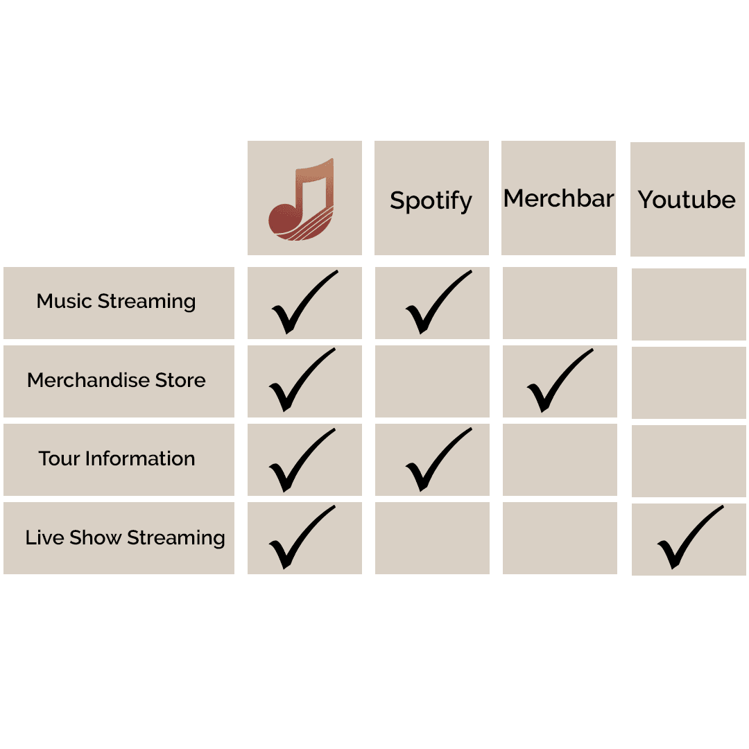
Competitor Analysis
A competitor analysis is necessary to identify strengths and weaknesses in existing platforms, allowing Murusa to stand out by addressing gaps in the market and offering a more seamless, all-in-one experience for music lovers.
IDEATION
Insights into Action: User Stories
A competitor analysis is necessary to identify strengths and weaknesses in existing platforms, allowing Murusa to stand out by addressing gaps in the market and offering a more seamless, all-in-one experience for music lovers.
As a fan who loves exclusive merch drops,
I want to be notified when new artist merchandise is released, so that I don’t miss limited-edition items.
As someone who follows multiple artists,
I want to easily see upcoming shows and buy tickets within the app, so that I can plan my concert calendar without switching platforms.
As a college student who loves discovering underground artists,
I want to find new music and instantly add it to my playlists, so that I can stay ahead of trends and support rising talent.
IDEATION
How Might We?
Building on the user stories and research insights, I translated key pain points into actionable How Might We questions. These helped guide ideation by framing user needs as opportunities—centering the design process around the musician’s creative and business goals.
How Might We...
help users effortlessly discover new artists that align with their unique tastes?

How Might We...
make exclusive merch drops feel personal, timely, and easy to purchase?
How Might We...
streamline the way users find, track, and attend live performances by their favorite artists?

IDEATION
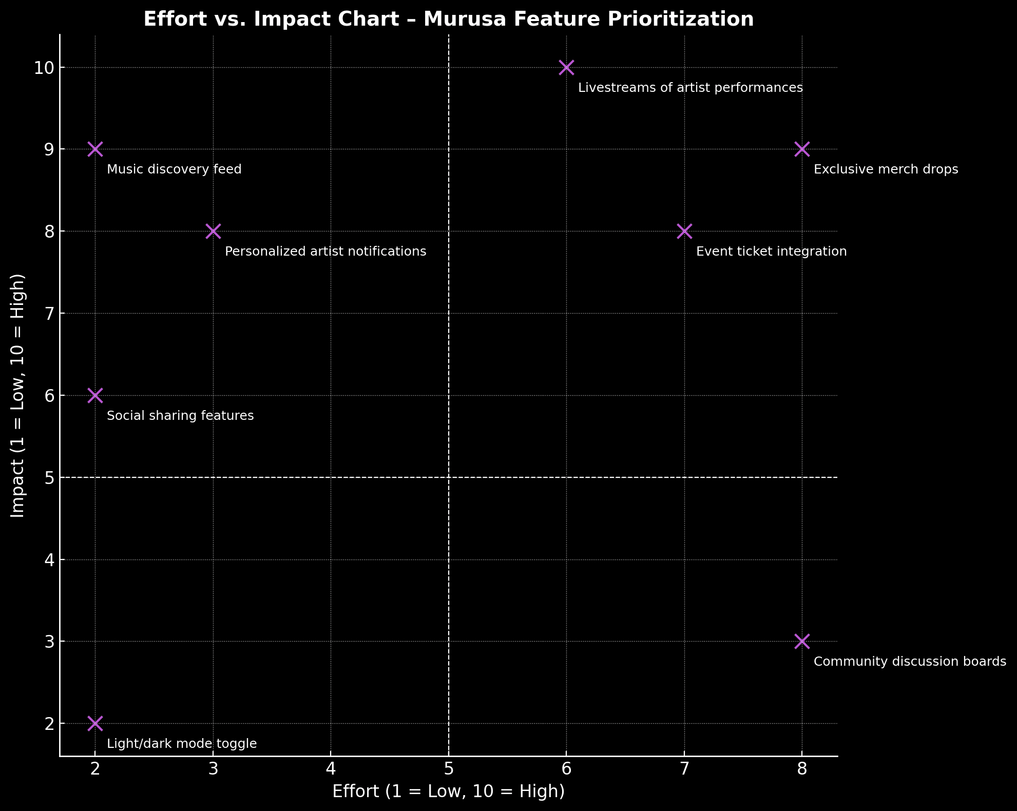
Effort vs. Impact
Prioritizing features isn’t just about what looks good—it’s about what moves the needle. I used an Effort vs. Impact chart to visually map out which features would deliver the most value to users while considering the design and development effort required.
Effort vs Impact
IDEATION
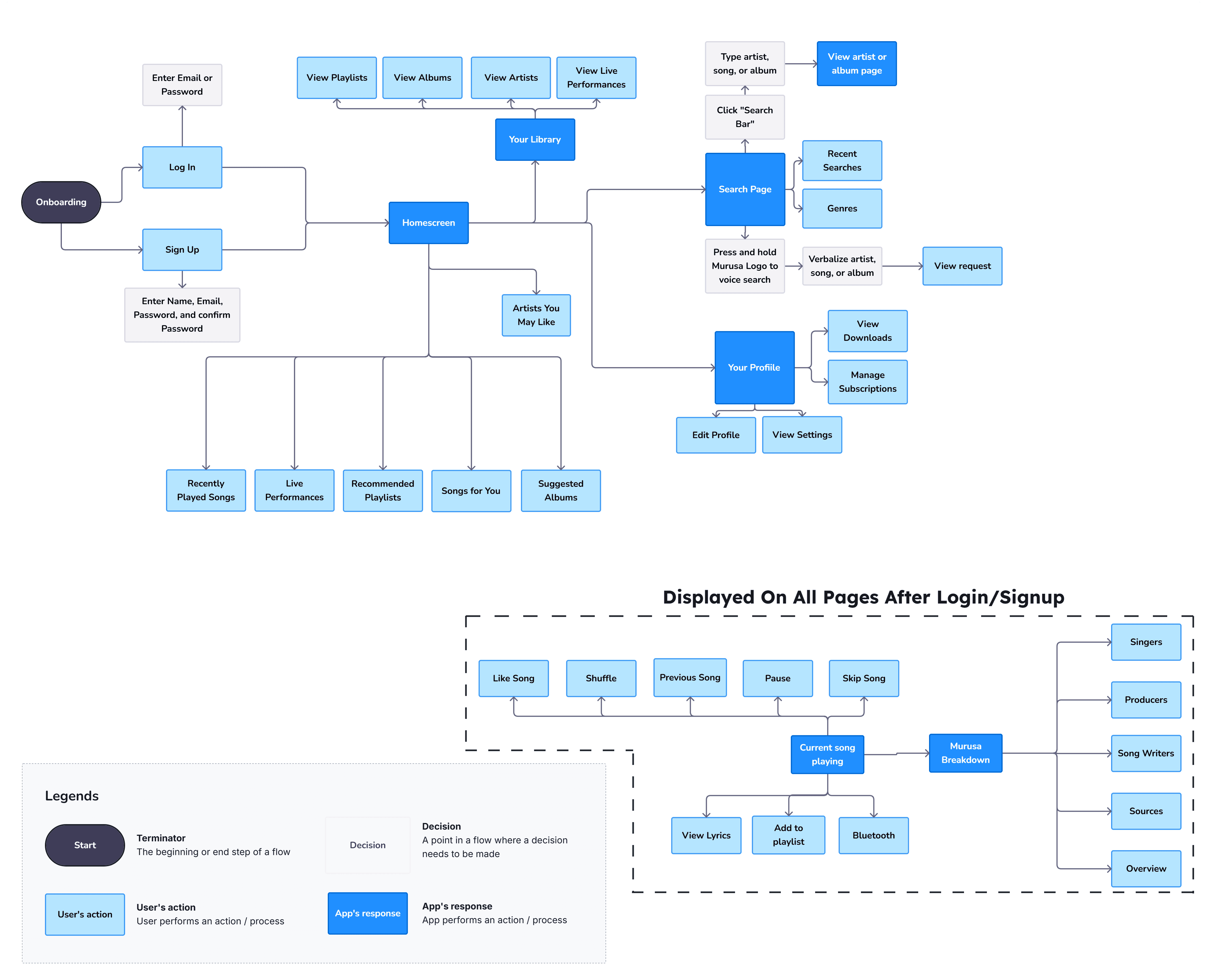
Userflow
The Murusa clients started with a rough outline of the user experience they envisioned. I took that initial idea and developed a comprehensive user flow in Visily, mapping everything from onboarding to the core features like streaming, merch shopping, and live events. Through continuous collaboration and feedback, we refined the flow to make sure it felt natural, easy to navigate, and in line with Murusa's mission of offering a seamless, all-in-one music platform.
Turning Insight into Interaction 🎶
DESIGN
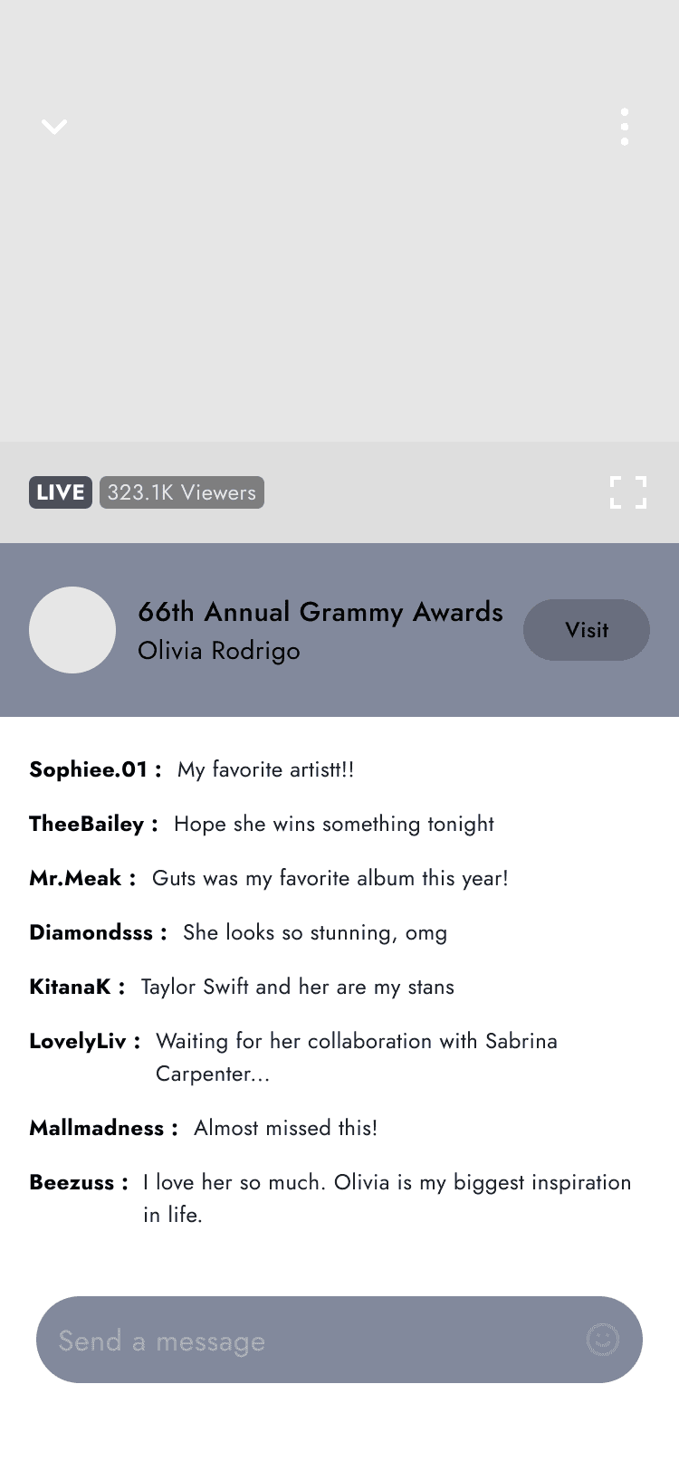
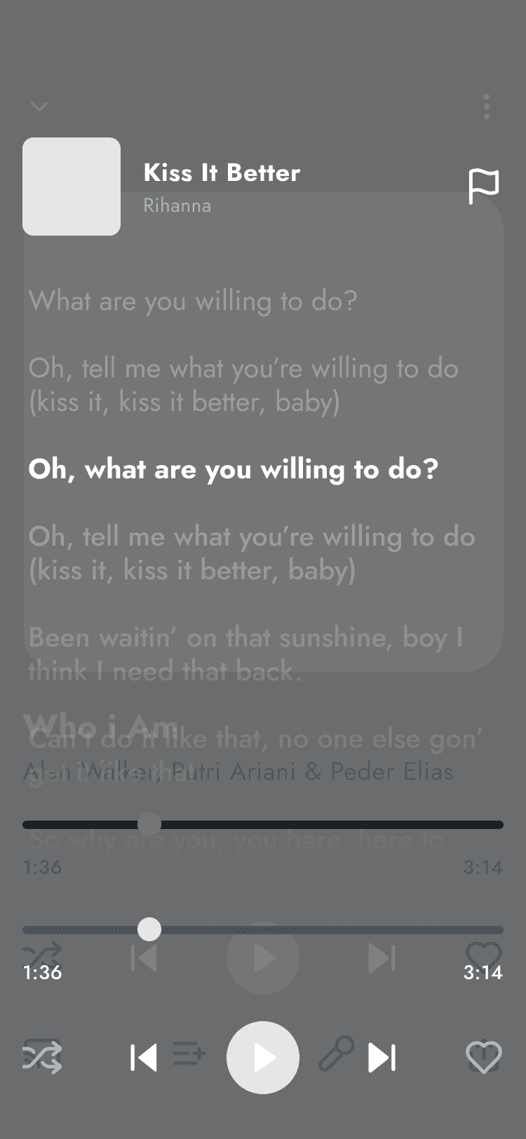
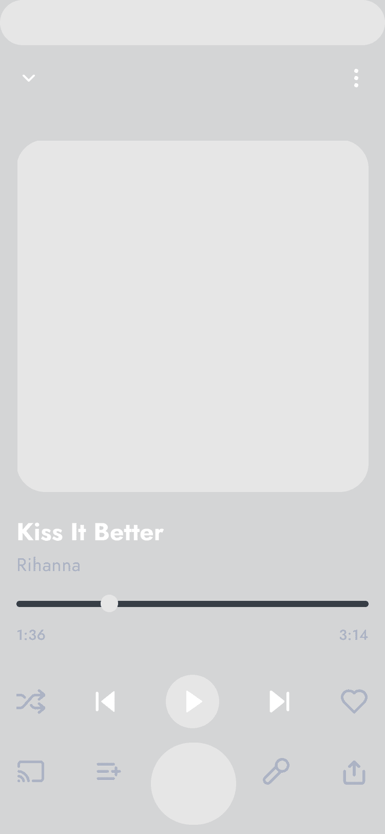
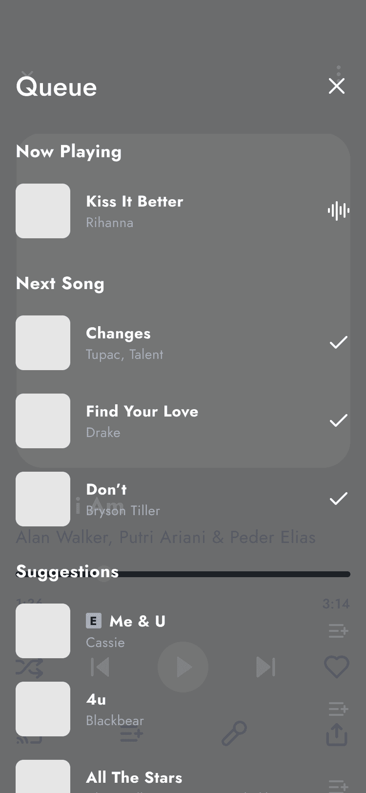
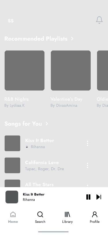
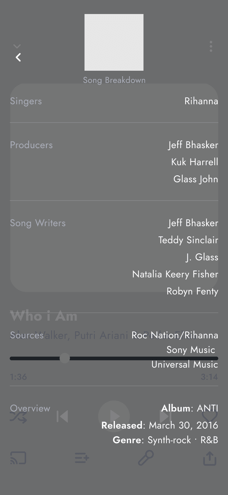
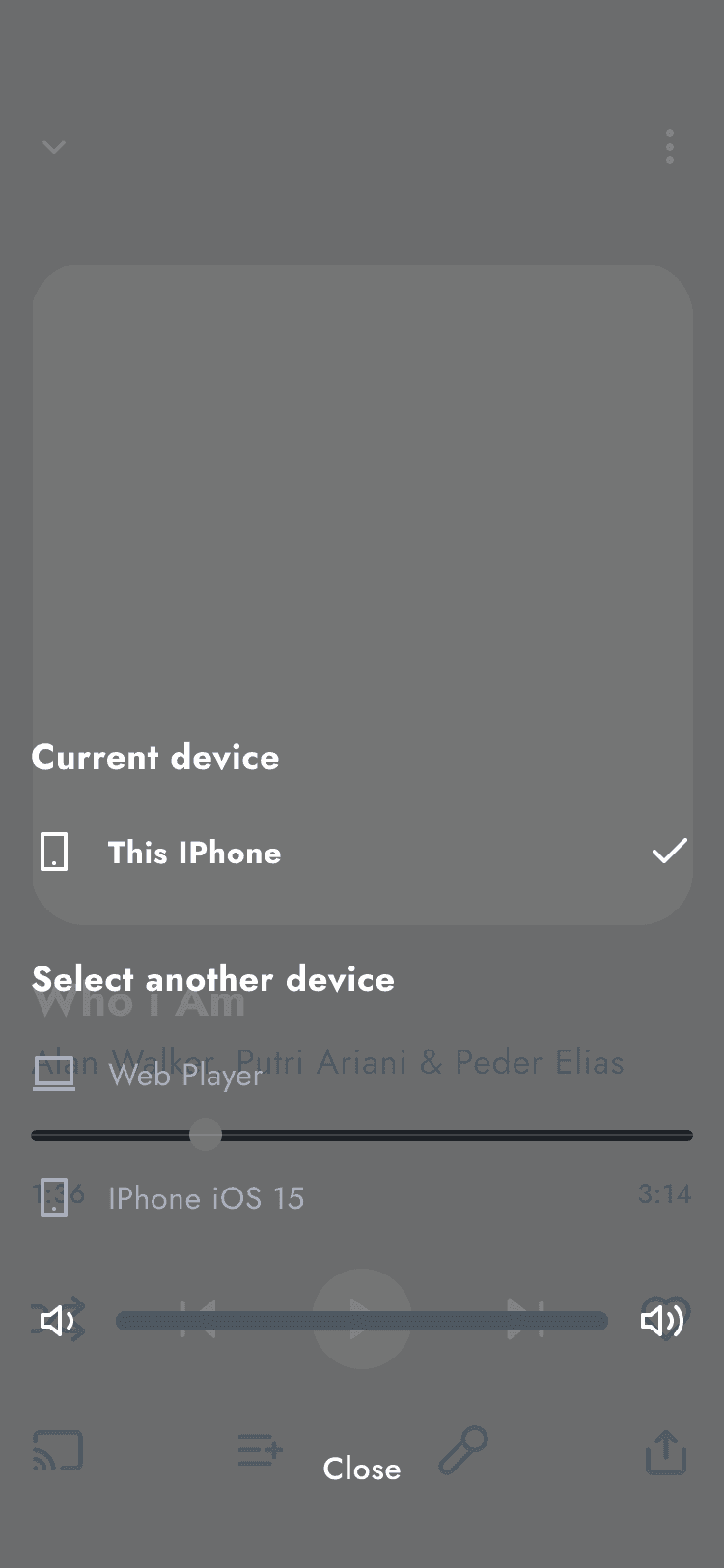
Mid-Fidelity Wireframes
Once the user flow was finalized and the interface concepts were outlined, I moved on to creating mid-fidelity wireframes for Murusa. These wireframes played an essential role in bridging the gap between the initial vision and the final design. By concentrating on the core features and interactions, they provided a solid blueprint for Murusa's user interface, ensuring a clear and functional design direction. Then, I was able to move on to crafting the mid-fidlity wireframing.
DESIGN & TESTING
Feedback and Iteration
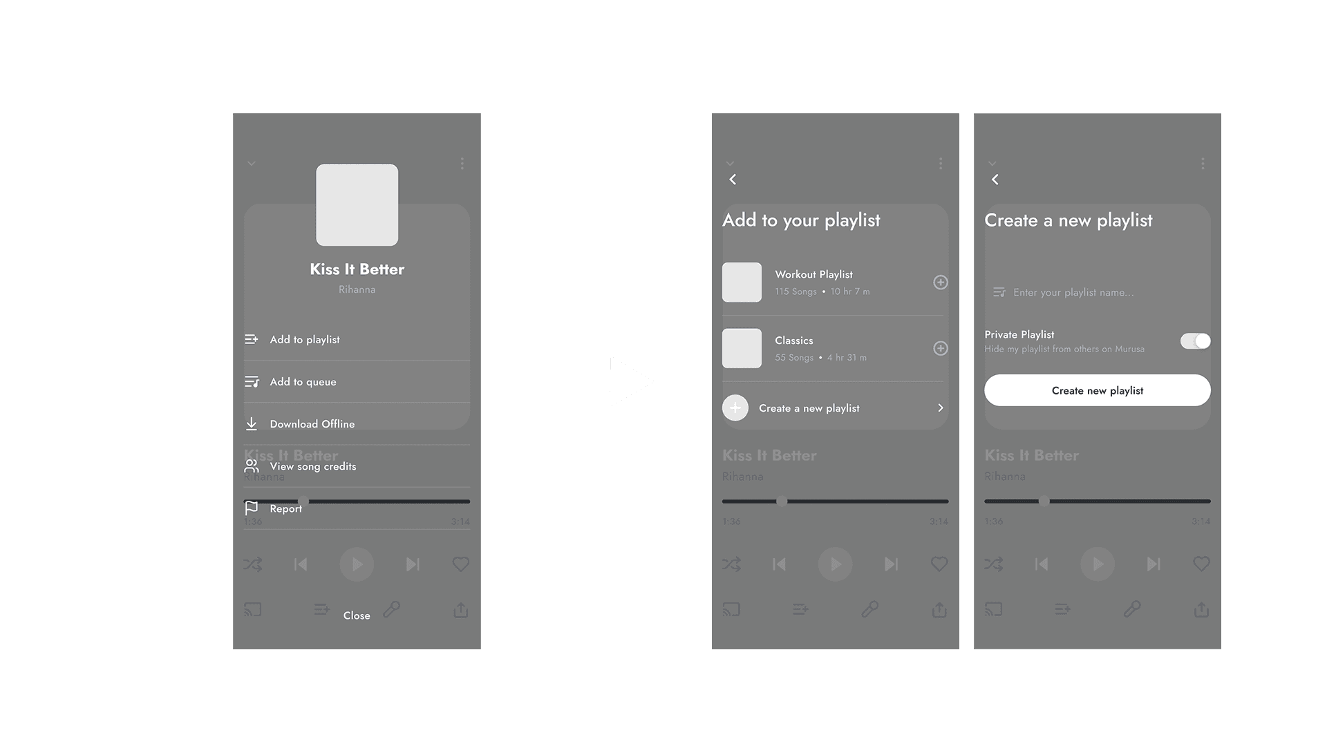
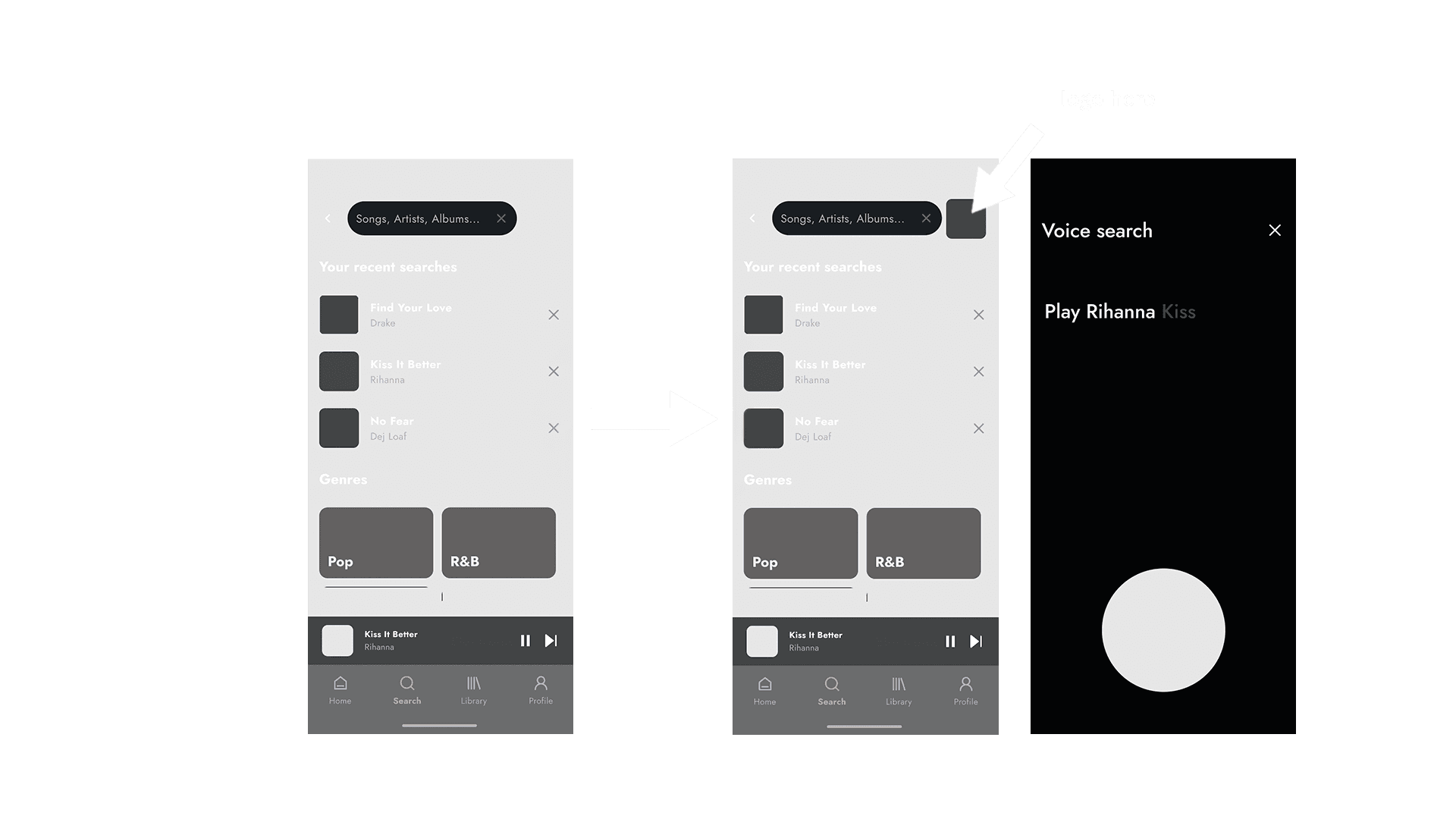
After prototyping the mid-fidelity wireframes with interactions in place, I shared it with the previous participants I had interviewed for them to test. Their feedback highlighted some challenges, especially around Murusa’s additional features. Users wanted a more seamless experience, so I added extra scenes to streamline navigation and incorporated options for voice control to cater to those who prefer hands-free interaction. Below, I'll explain two key improvements made to enhance the user experience.
1.0 User Insights
🎧 Users found the "Add to Playlist" feature too basic and limited.
📄 Many wanted the option to create new playlists directly while adding songs.
🔄 Feedback suggested that users wanted more control over where their songs were being added.
Problem
Solutiuon
1.0 Improvements
➕ Added a feature allowing users to select a specific playlist when adding a song.
🎶 Introduced the option to create a new playlist directly from the "Add to Playlist" screen for smoother navigation and customization.
🚀 Streamlined the process to make it quicker and more intuitive, enhancing the overall user experience.
Problem
Solutiuon
2.0 User Insights
🎤 Some users expressed a preference for hands-free interaction, especially when multitasking.
🔍 Users found manually searching for songs or podcasts time-consuming and wanted a faster, more convenient option.
⚡ Feedback showed a desire for quicker access to music, podcasts, and playlists, especially during on-the-go moments.
Problem
Solutiuon
2.0 Improvements
🗣️ Introduced a voice search feature, allowing users to find music, podcasts, or playlists through voice commands.
🎙️ Optimized the feature for easy, hands-free navigation, catering to users who prefer a more seamless, interactive experience.
🚀 Enhanced overall search speed and accessibility, improving user convenience and satisfaction.
DESIGN & TESTING
Brand Development
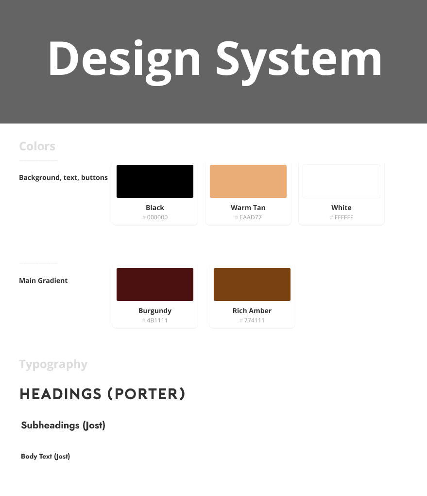
developed a brand that felt bold, artistic, and rooted in music culture. Inspired by live performances, vinyl textures, and the DIY spirit of independent artists, the visual direction blends expressive typography, moody gradients, and rich contrast.
Read article
Murusa's Branding
For Murusa’s brand development, I focused on creating a bold and dynamic identity that reflects the energy of Gen Z music lovers.
The color palette, featuring a warm blend of deep burgundy, soft golden-brown, and rich amber (#774111), evokes a sense of warmth, creativity, and depth. These shades give the app a distinct, inviting feel, while still maintaining a modern edge.
The sleek design elements, combined with this vibrant color scheme, help convey Murusa’s all-in-one music experience, from streaming and live shows to merch and podcast discovery. This brand identity was crafted to resonate with users seeking a seamless, exciting, and immersive platform.
Introducing Murusa
Reflection + Next Steps
⚠️ Challenges
Murusa faced key challenges, including balancing rich features with a simple user experience and standing out in a crowded music streaming market. Through ongoing collaboration, user testing, and adaptable design, we refined the product into a more intuitive and user-focused platform.
📚Learnings
Working on Murusa deepened my understanding of user-centered design and audience needs. Research and testing highlighted the value of seamless navigation and personalization, while features like live event streaming and curated music elevated the overall experience.
This project strengthened my confidence in navigating ambiguity, collaborating across disciplines, and advocating for user needs at every stage. In addition to the learnings throughout the challenges I faced, I took note that:
01: User-Centered Design is Crucial
Understanding the needs and preferences of users through research and feedback significantly enhances the effectiveness of the design process and the final product.
02: Seamless Navigation Improves Engagement
Prioritizing intuitive navigation and features like voice search helps create a more enjoyable and accessible user experience, leading to higher engagement and satisfaction.
03: Iterative Development is Essential
Continuous testing and iteration based on user feedback allow for ongoing improvements and refinements, ensuring the app remains relevant and valuable to its audience.
Check out more of my case studies!
Other Designs