More White Coats
Culturally Matched Mentorship for the Next Generation of Doctors
Overview
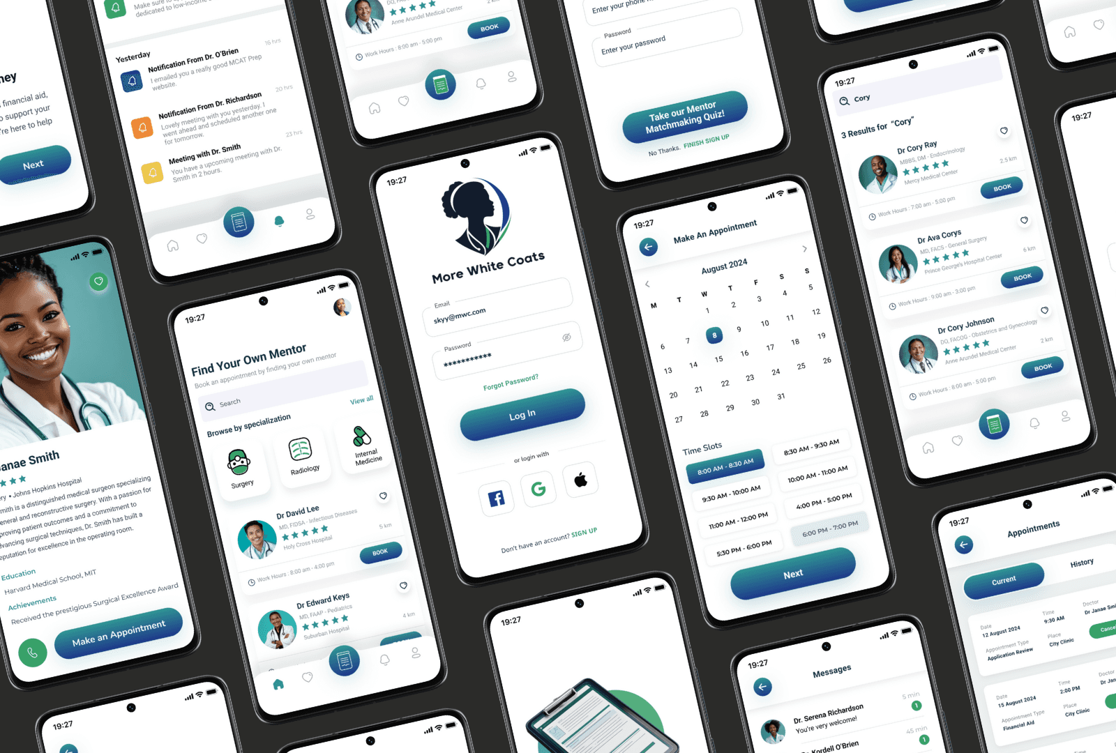
More White Coats is an app focused on guiding underrepresented and low-income students toward medical careers. Through intuitive UI/UX design and personalized mentor matching, I created a platform that connects aspiring medical professionals with mentors who share their background and experiences.
Tools
Adobe Creative Suite
Visiliy
Figma
Zoom
My Team
Me (Designer)
Bryelle Nikole (Client)
Drew Cones (Client)
My Role
UX Design Lead
Timeline
Overall: 8+ weeks
Discovery & Research: 2+ weeks
Design & testing: 6 weeks
Problem
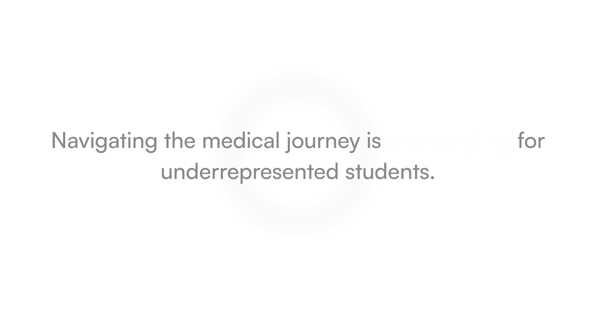
Pursuing a medical career is especially tough for minorities and low-income students due to financial barriers and a lack of relatable mentorship and representation
Solutiuon
More White Coats empowers minority and low-income pre-med students through mentorship, culturally competent counseling, and a supportive community platform.

My Design Process
Research
Ideation
Design
Test & Refine
RESEARCH
Identifying Problems
To ground the app in real experiences, I conducted interviews with five individuals aged 18–28, all navigating the journey toward a medical career. Their stories revealed the unique barriers faced by minority and low-income students—lack of guidance, cultural disconnects, and feelings of isolation. These insights shaped the foundation of More White Coats, culminating in a focused problem statement that drove the app’s design and purpose.
Pain Points
Financial Barriers
Users face steep medical education costs and limited access to financial aid.
Lack of Representation
Relatable mentors are scarce, making it hard for users to find guidance they connect with.
Limited Access to Mentorship
Users often struggle to find and schedule time with experienced mentors for personalized support.4o
Navigating Career Paths
Users often feel overwhelmed by medical career paths and need help exploring specializations.
Cultural Competency
Users need culturally sensitive counseling and support, which isn't always accessible.
Community and Networking
Supportive peer networks are lacking, limiting users' ability to connect and share resources.
↓↓ Problem Statement ↓↓
RESEARCH
Exploring Barriers in Medical Education
The purpose of my desk research was to uncover the systemic and emotional challenges faced by underrepresented and low-income students pursuing careers in medicine.
By examining existing mentorship platforms, educational support tools, and diversity initiatives, I identified key gaps—such as lack of culturally matched guidance, limited access to mentorship, and inadequate emotional support.
Based on secondary sources—particularly diversity reports in medical education and mentorship studies—three key insights emerged:
Users want a supportive community to share experiences and receive encouragement from peers and mentors.
There's high demand for mentors who understand users' cultural and socioeconomic challenges.
Access to quality, tailored resources is limited, leaving users feeling unprepared for med school exams.
RESEARCH
Competitor Analysis
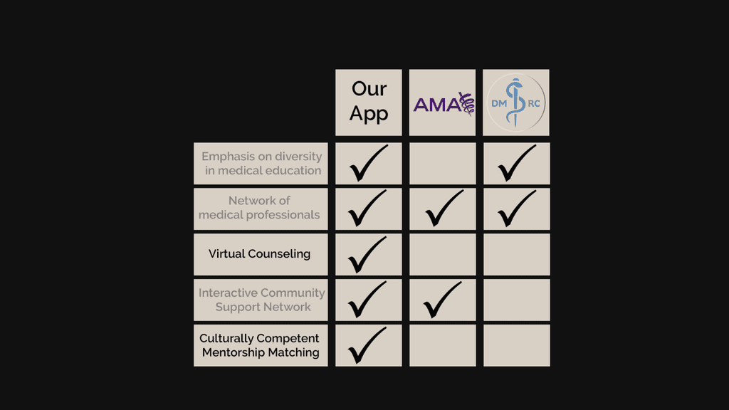
While many provide academic resources and general mentorship, we noticed a notable gap in two critical areas:
Mental health support is often generalized or absent altogether, with minimal focus on culturally sensitive care or teletherapy designed for marginalized medical students.
Few platforms offer mentor pairing that considers shared identity, background, or lived experience—key elements that increase trust and relatability for underrepresented students.
Then, pinpointed what users truly need…
RESEARCH
Meet the Students We’re Designing For
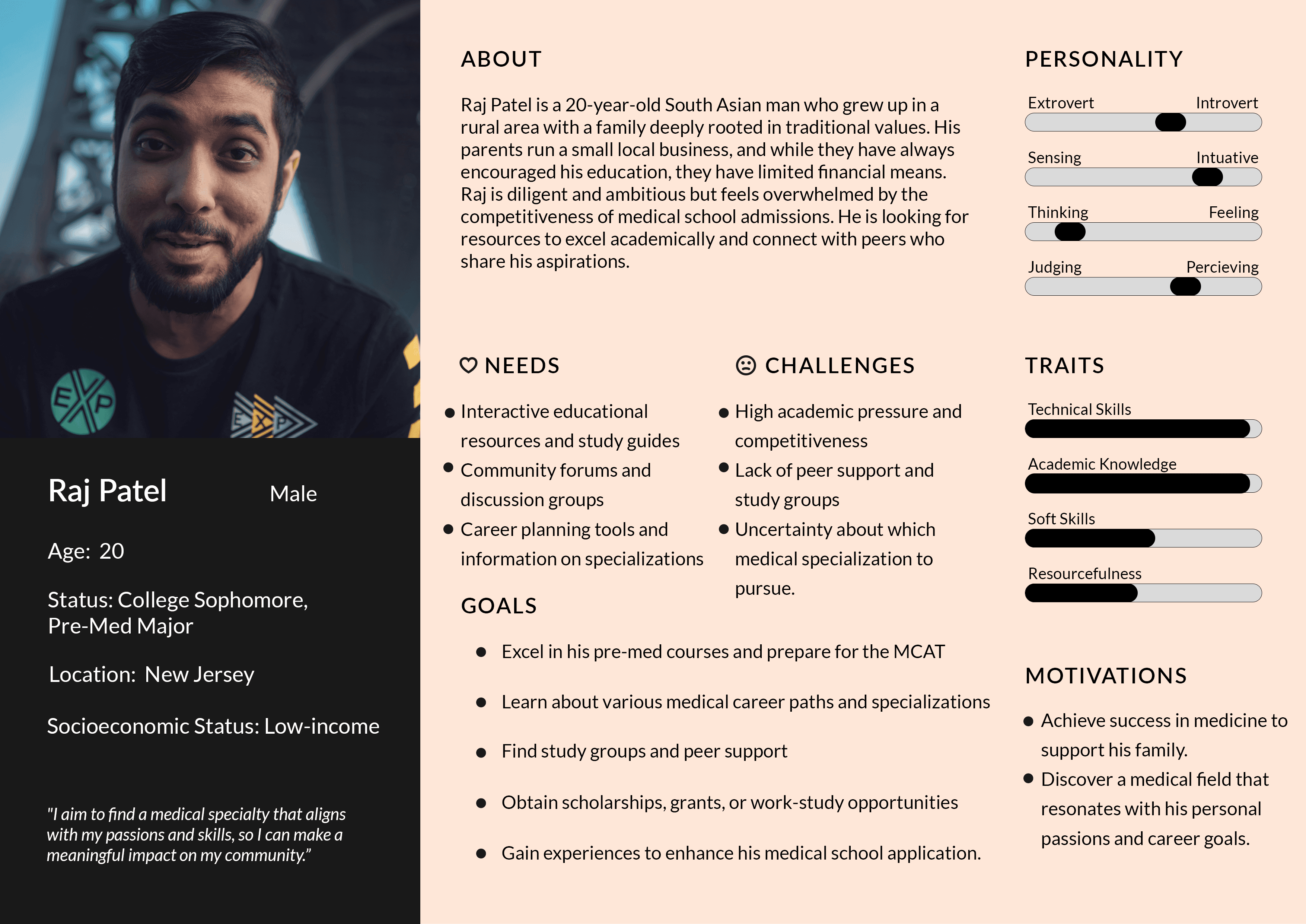
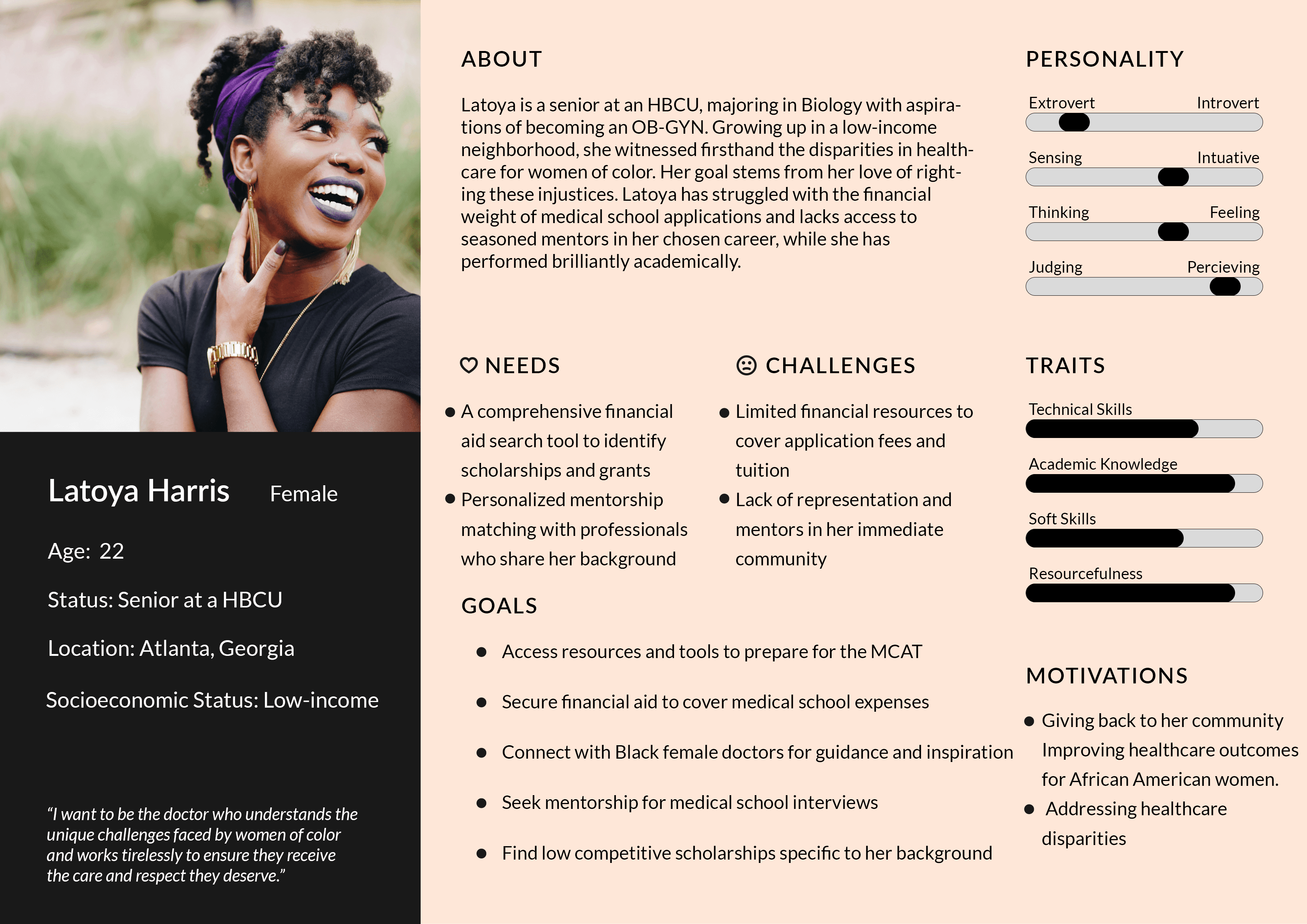
Building user personas helped us understand the emotional and systemic challenges underrepresented medical students face beyond academics. We uncovered that:
Representation deeply impacts retention. Students often felt isolated in predominantly white institutions and lacked role models who looked like them or shared similar cultural values.
Mentorship needs to go beyond academics. Users valued mentors who could relate to their background, offer emotional support, and help them navigate implicit bias in clinical settings.
Mental health support must feel safe and affirming. Many students were hesitant to seek help due to fear of being misunderstood or stigmatized.
So…how exactly would a user navigate the app?
RESEARCH
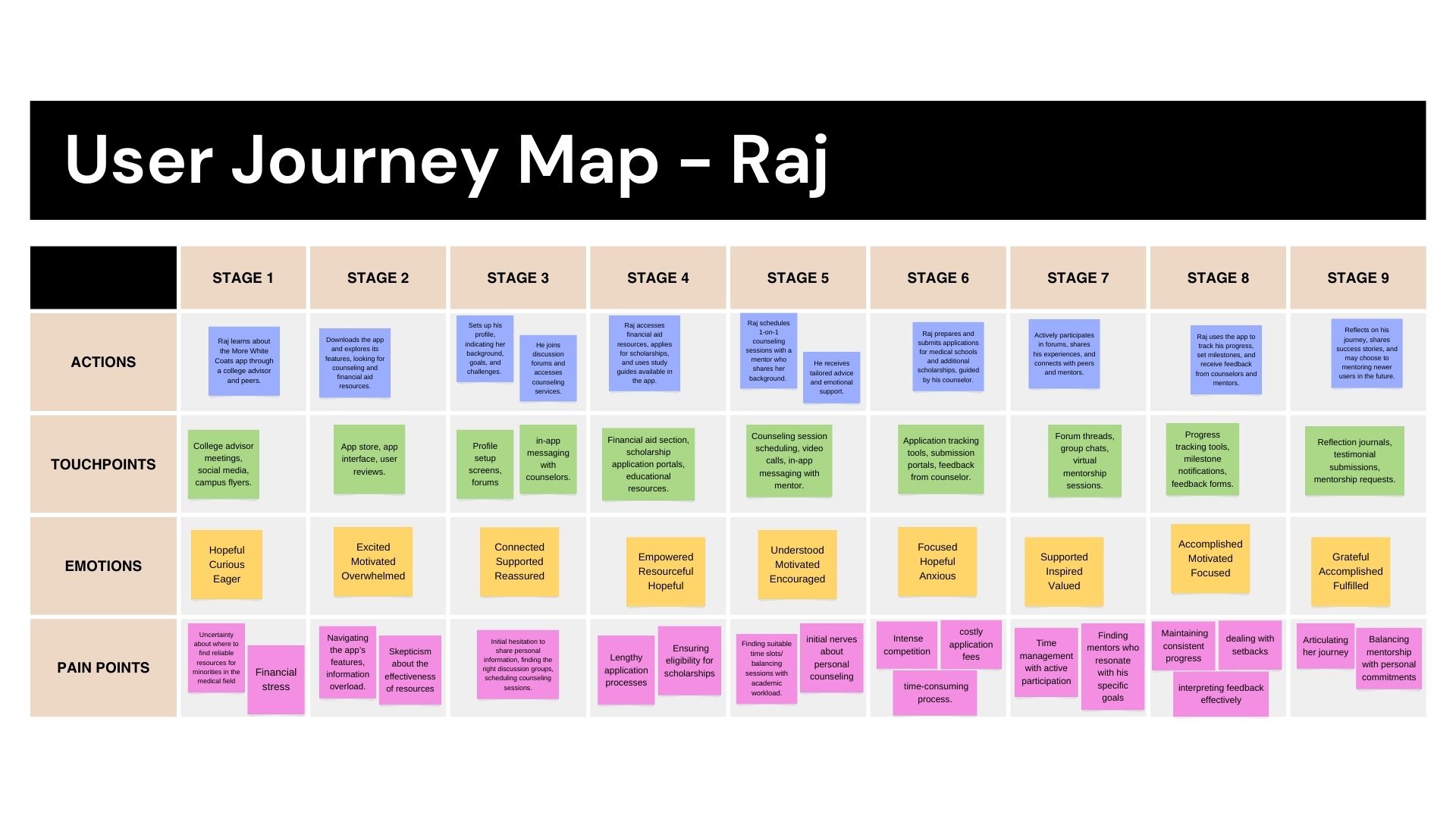
Understanding User Friction Points
For More White Coats, mapping the user journey for scheduling a one-on-one counseling session is crucial to ensure a smooth and intuitive process. It helps identify and resolve any obstacles users might face, making the scheduling experience as straightforward as possible.
Now, was time to further explore user-centered creative directions.
IDEATION
Framing User Goals
I was able to clarify the functions that consumers wanted and explain the value it provides by creating user stories. The process of prioritizing things helped me to clearly identify the essential elements that need to be included.
As a user, I want to…
Access reliable and comprehensive information
on scholarships and financial aid opportunities to support my medical education.
Connect with mentors and counselors
who understand my cultural and socioeconomic background for personalized guidance and encouragement.
Find and join study groups & forums
where I can interact with peers, share experiences, and receive academic support.
Use curated and organized resources
to efficiently navigate pre-med requirements, medical school applications, and various medical career paths.
Receive personalized career planning tools
and advice to help me make informed decisions about my medical specialization and future career.
IDEATION
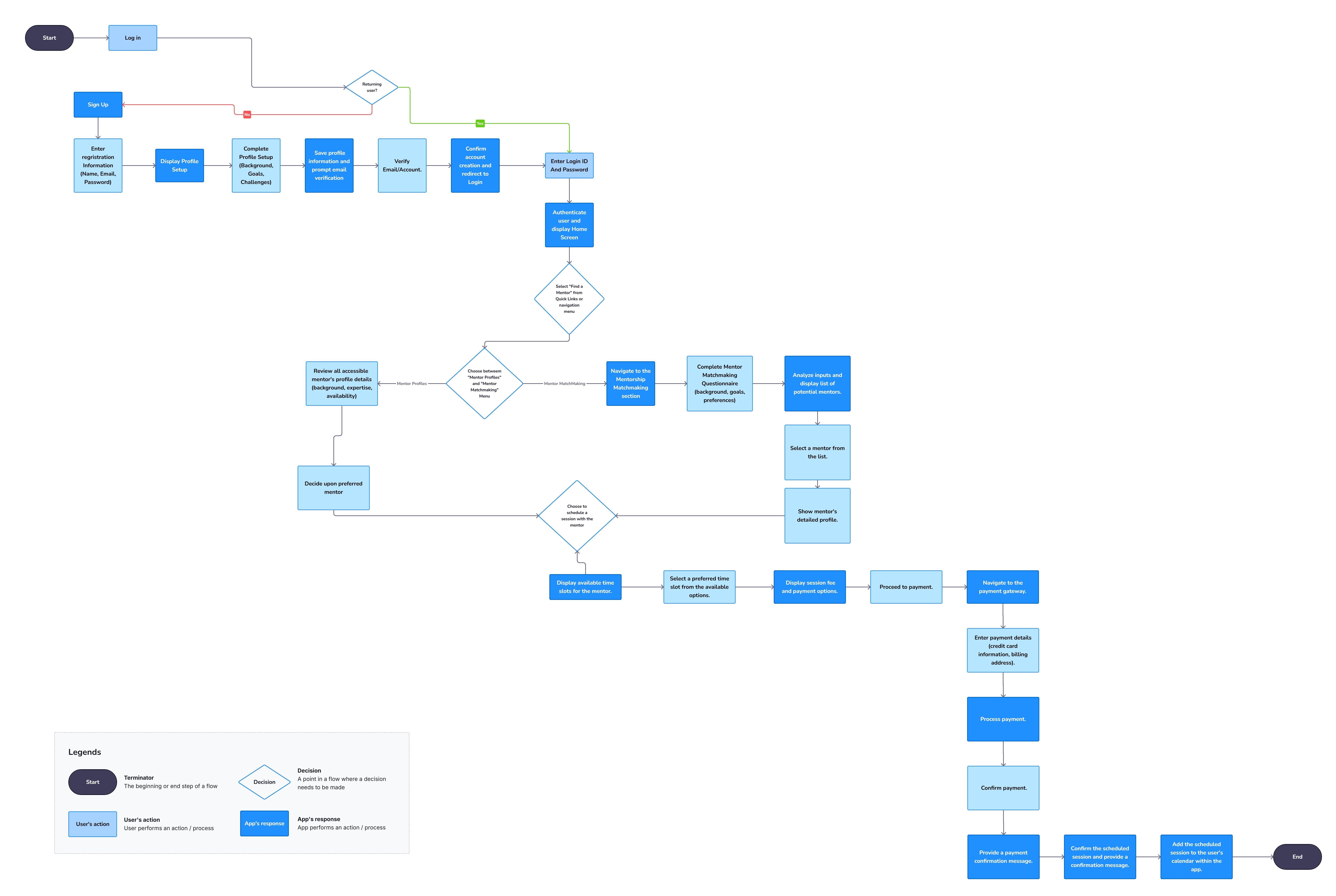
Mapping the Experience
Before diving into wireframes, I sketched out the user’s ideal path—step by step, click by click—to make sure every interaction had purpose.
IDEATION
Early Explorations
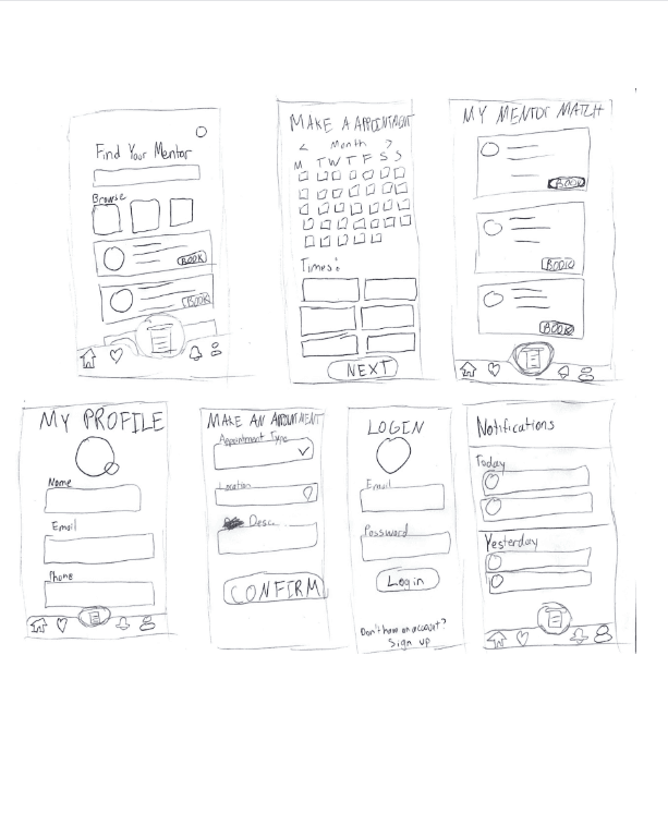
Sketching was a crucial step in translating abstract ideas into tangible solutions. It allowed me to:
Quickly explore and iterate on multiple layout ideas without getting caught up in pixel-perfect details.
Identify what features mattered most to users by visually mapping their priorities, like easy access to mentors and support resources.
Spot usability issues early—I noticed where certain flows felt too complex or where features could be simplified before moving into wireframes.
This hands-on phase helped us stay user-focused, fast, and flexible, ensuring our concepts stayed grounded in real needs.
Read article
DESIGN
From Sketch to Structure
I started by carefully going over each sketch and deciding which ones worked best before using Figma to create a greyscale wireframe that would show the anticipated user interface and interactions. Outlining the essential components and interactions was the main objective in order to guarantee a simple and easy-to-use user experience.
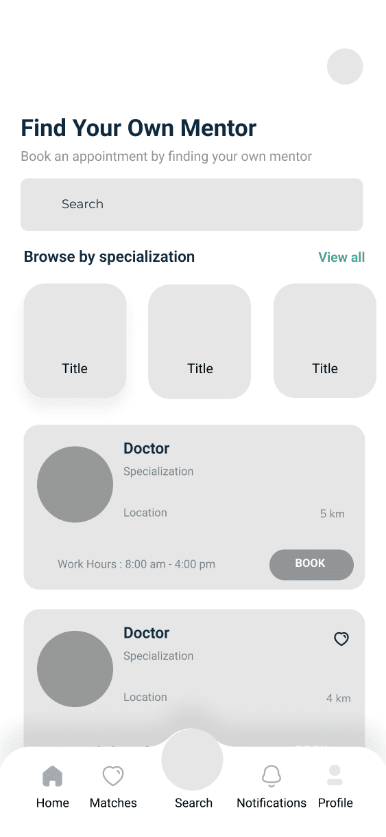
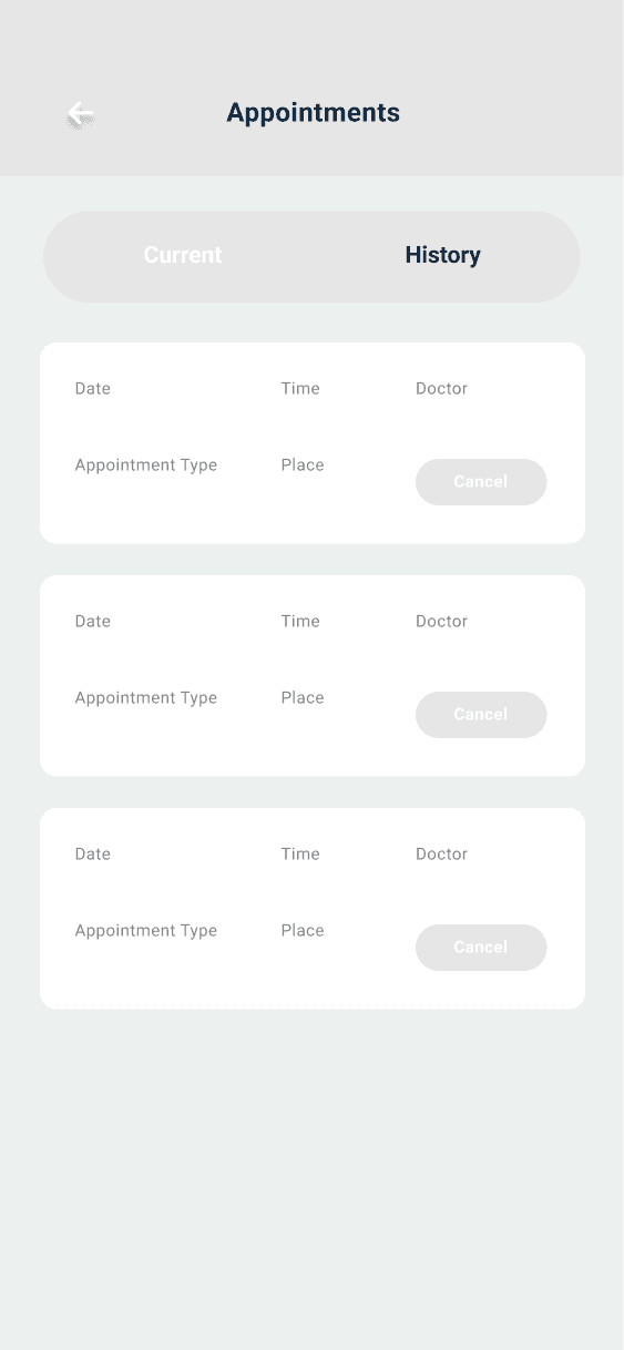
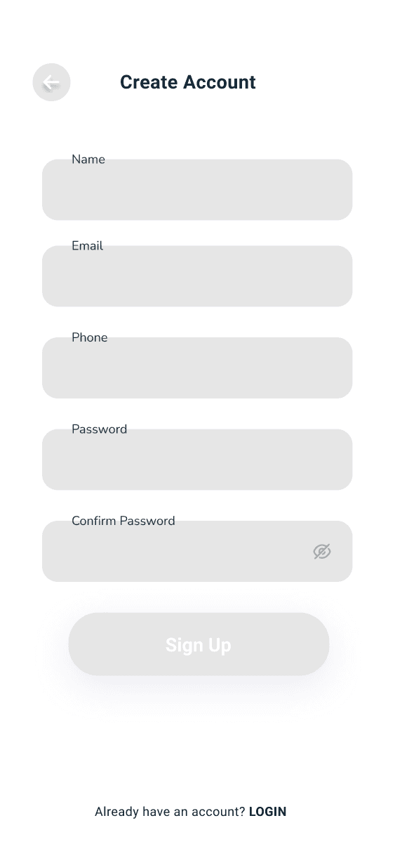
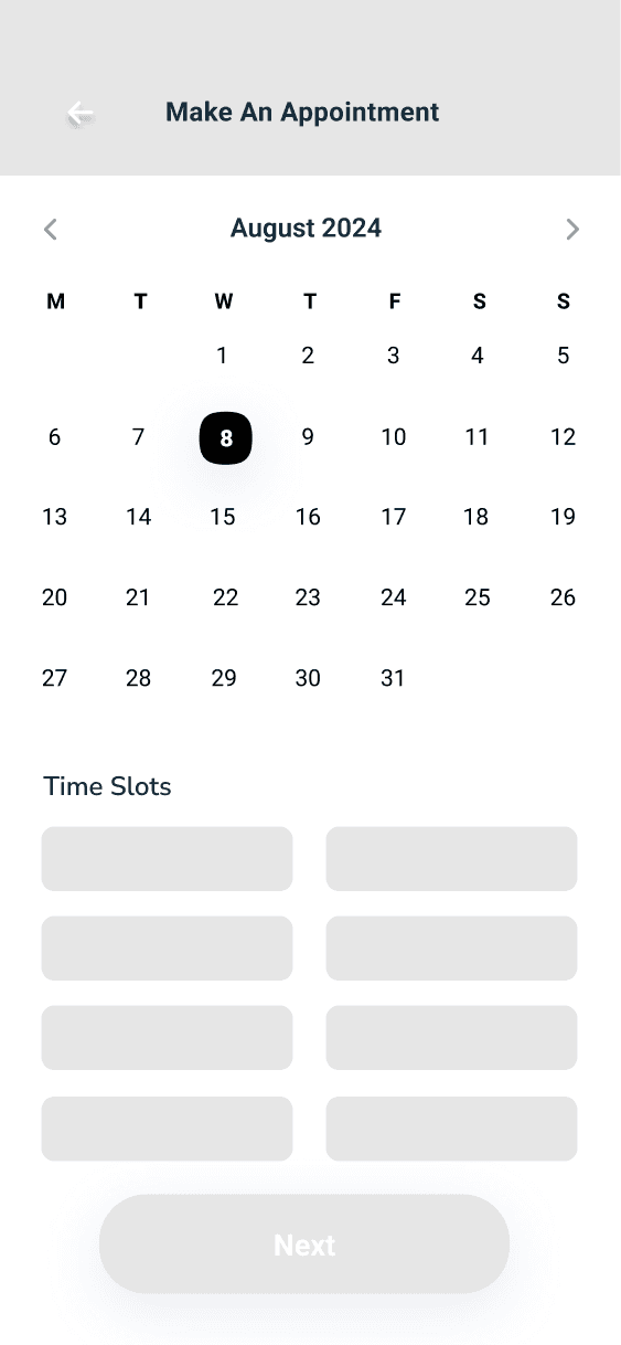
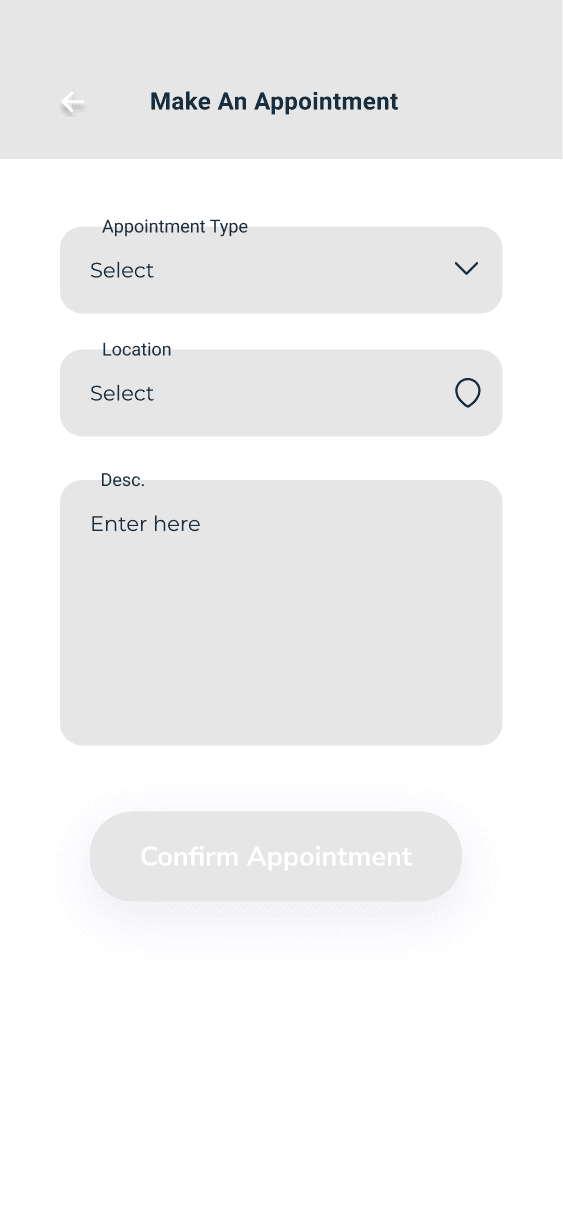
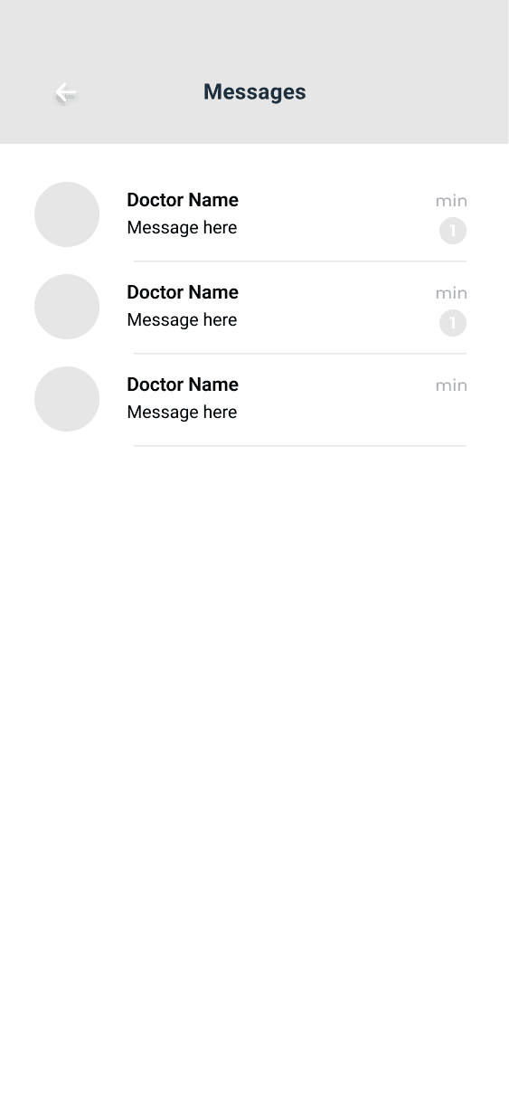
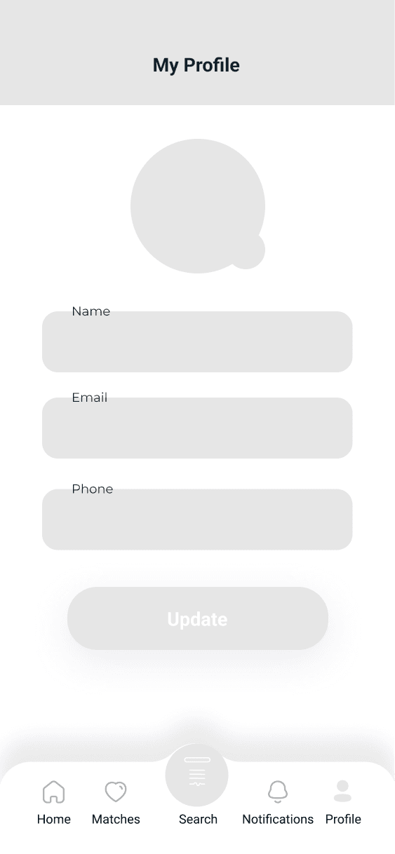
At this point, I was ready to develop a visual identity that truly represented the intended purpose of our product at this stage of the design process.
DESIGN
UI Foundation
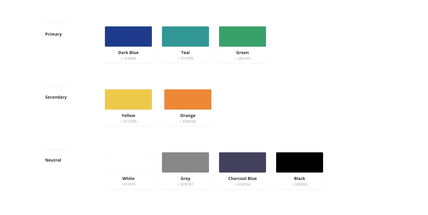
I created a unified and aesthetically pleasing design system for More White Coats as the designer. This required putting out an extensive style guide that described fonts, iconography, color schemes, and other visual components. I made sure that the platform looked cohesive and professional by creating uniform design patterns and principles. Throughout the development process, this design approach promoted cooperation and preserved visual coherence.
DESIGN
Color Exploration
The colors were chosen intentionally to create a sense of trust, warmth, and representation—key pillars of support for underrepresented medical students. Here’s why they mattered:
Soft, calming tones (like blues or neutrals) signaled safety, reassurance, and professionalism, helping users feel at ease when accessing mentorship or counseling.
Accent colors were used to highlight pathways to action—like finding a mentor or booking a session—without overwhelming the interface.
The palette was crafted to feel inclusive and culturally respectful, avoiding overly clinical or impersonal tones often found in traditional medical platforms.
Ultimately, the color system helped shape an experience that felt affirming, supportive, and approachable—not just functional.
DESIGN
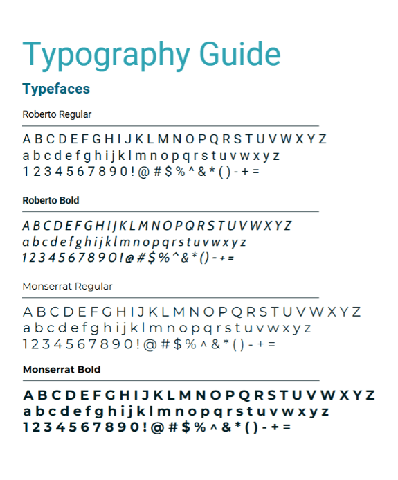
Typography
By using Roboto for its clean and modern sans-serif appearance and Monserrat for its contemporary, sleek touch, the More White Coats app can maintain a professional, inviting, and trustworthy design.
Roboto ensures readability and a contemporary feel, while Monserrat adds sophistication and emphasis where needed. This combination helps create a balanced and user-friendly interface that aligns with the app's goals and audience.
Read article
Listening, Learning, and Iterating…
TEST & REFINE
Usability Testing
Five volunteers in a moderated usability test were used to virtually test the prototype in order to identify any usability problems or discrepancies between the expected and actual functioning of the application using Figma.
Test Objectives:
Determine how easily users can navigate through the app.
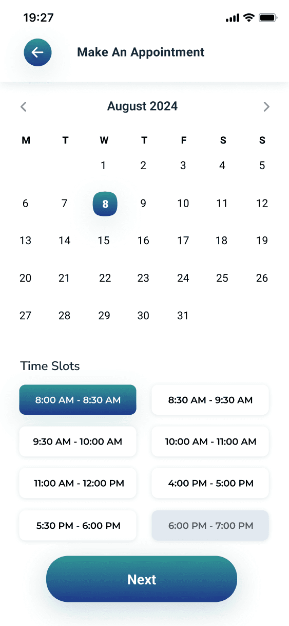
Assess how efficiently users can complete key tasks, such as scheduling a mentor session, finding financial aid information, and accessing study guides.
Ensure that educational resources, financial aid information, and counseling services are easily accessible and understandable.
Issue 1
The app may present challenges for users who lack prior familiarity with its features and functionalities.

Issue 2
Most of the users typically sign in through other mobile apps, such as Google, Facebook, and Apple.

Issue 3
Text on bottom tab is very cluttered and unnecessary to the interface.

Reiterations:
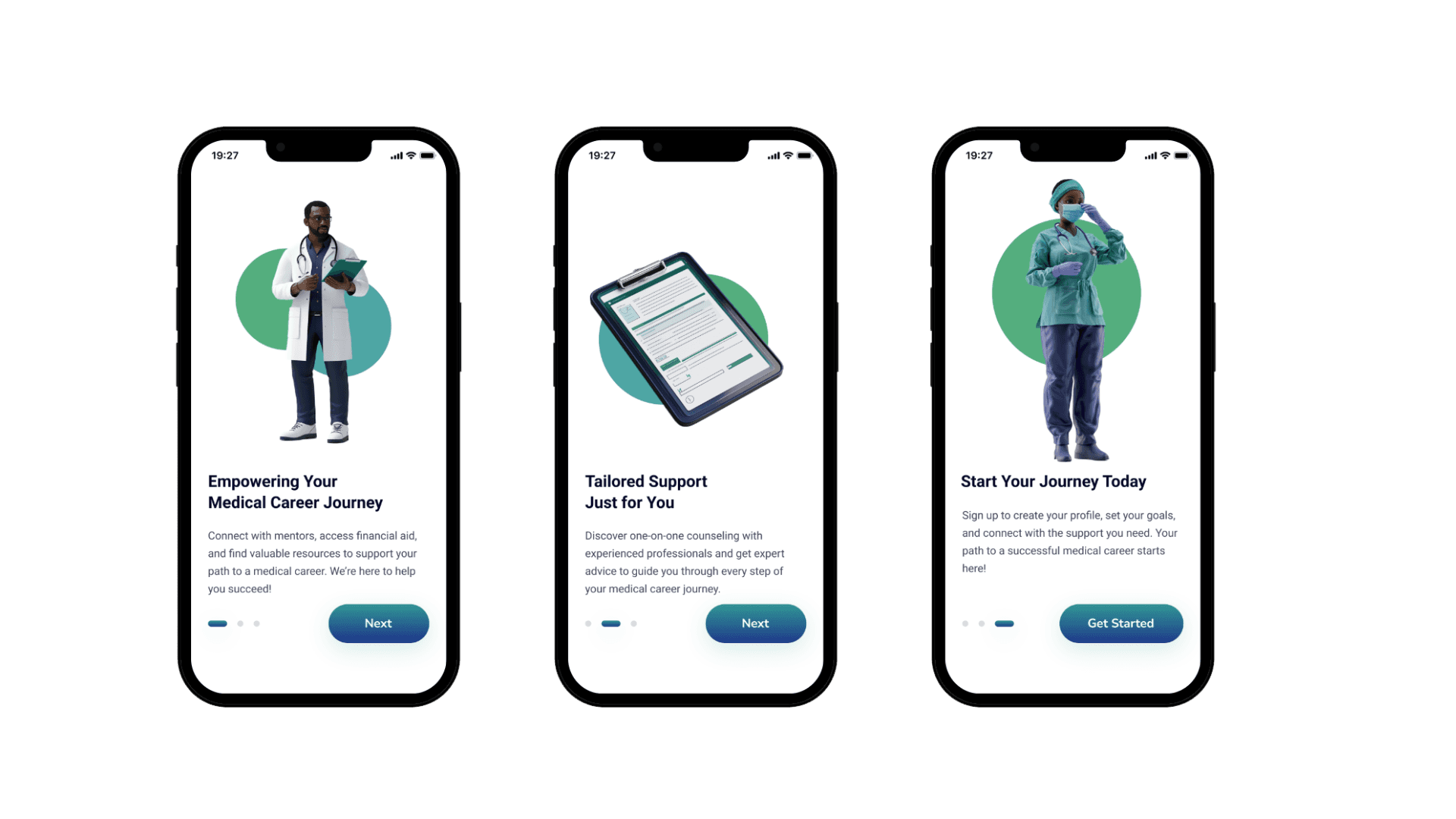
Update 1:
ⓧ No explanation of app's functions and purposes
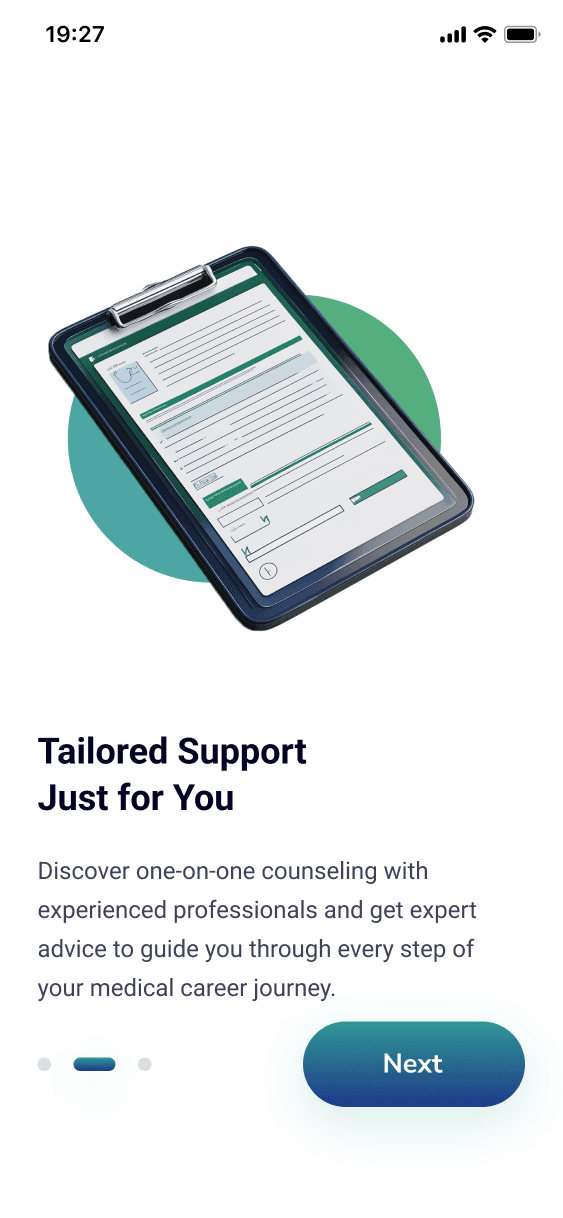
✔ Providing users with an onboarding experience
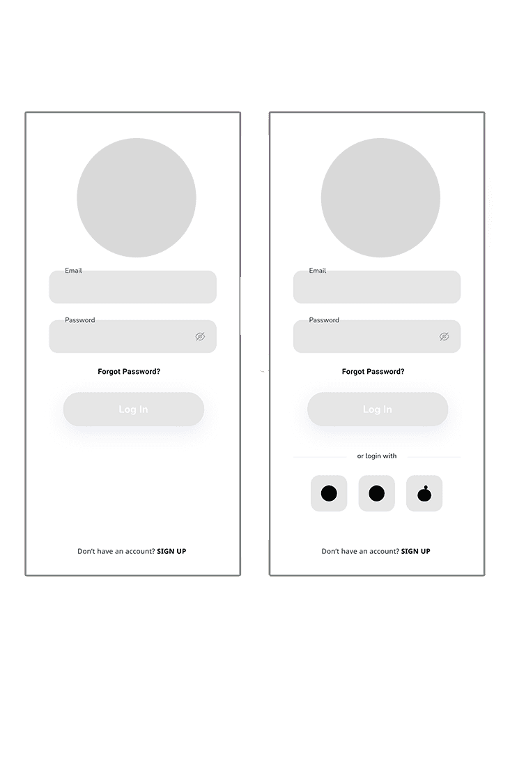
Update 2:
ⓧ Limited Sign-up options
ⓧ Requires extensive log-in process
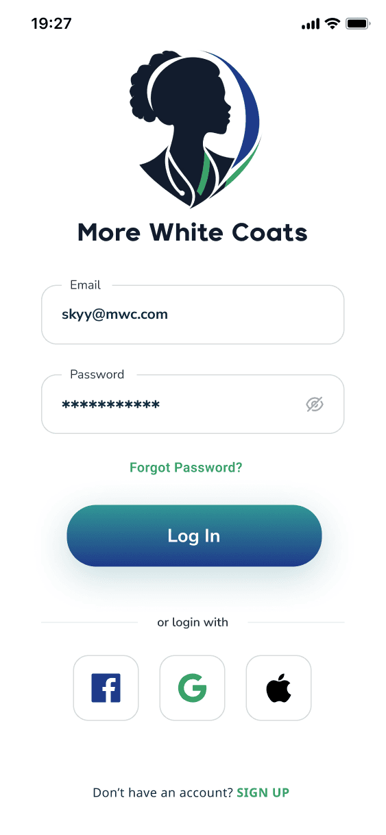
✔ Let users sign in through other platforms
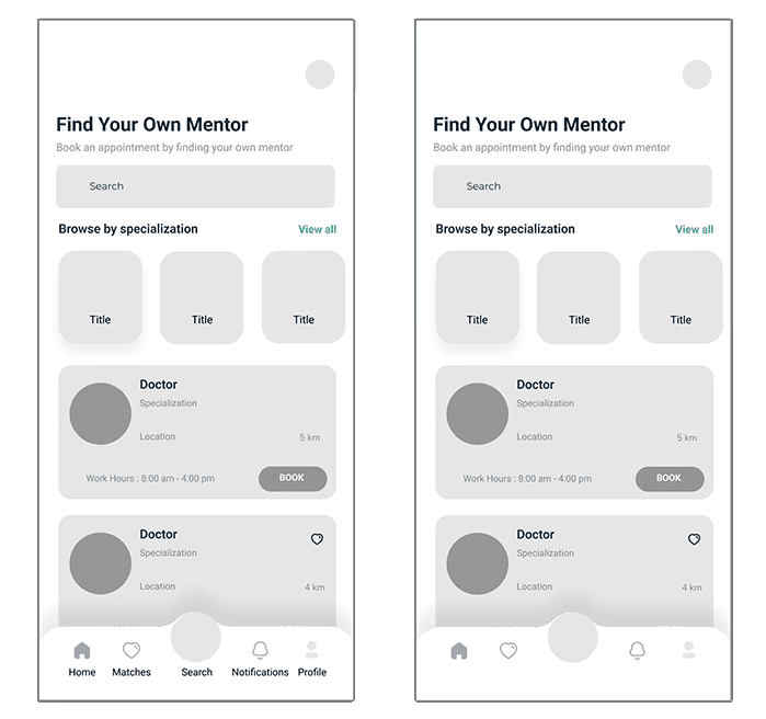
Update 3:
ⓧ Interface looks cluttered and is over-explained
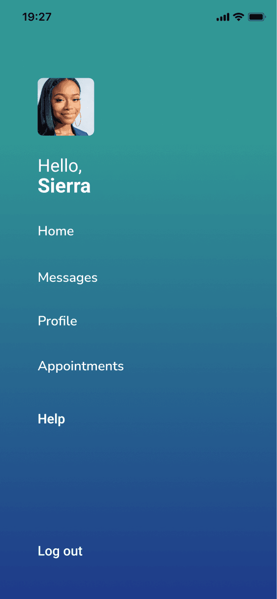
✔ Navigation is simplified and interface looks cleaner
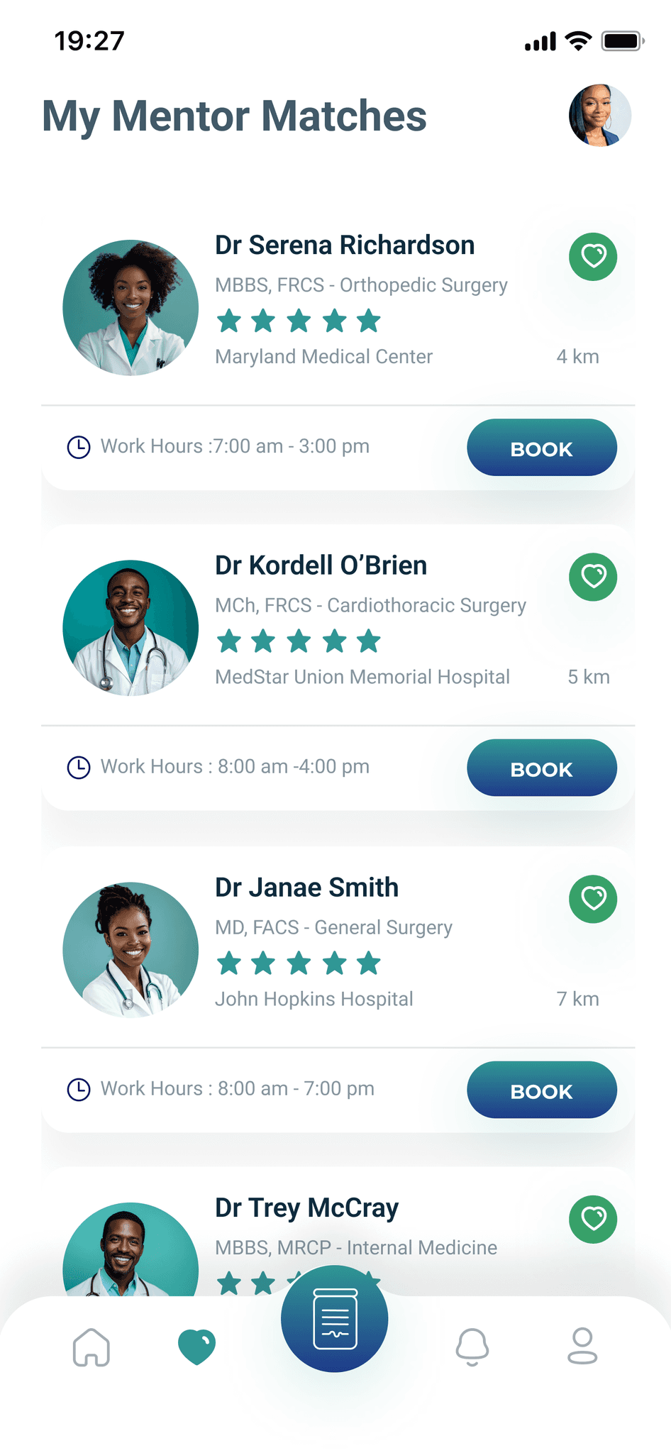
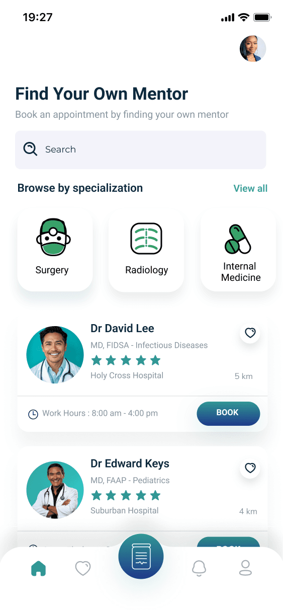
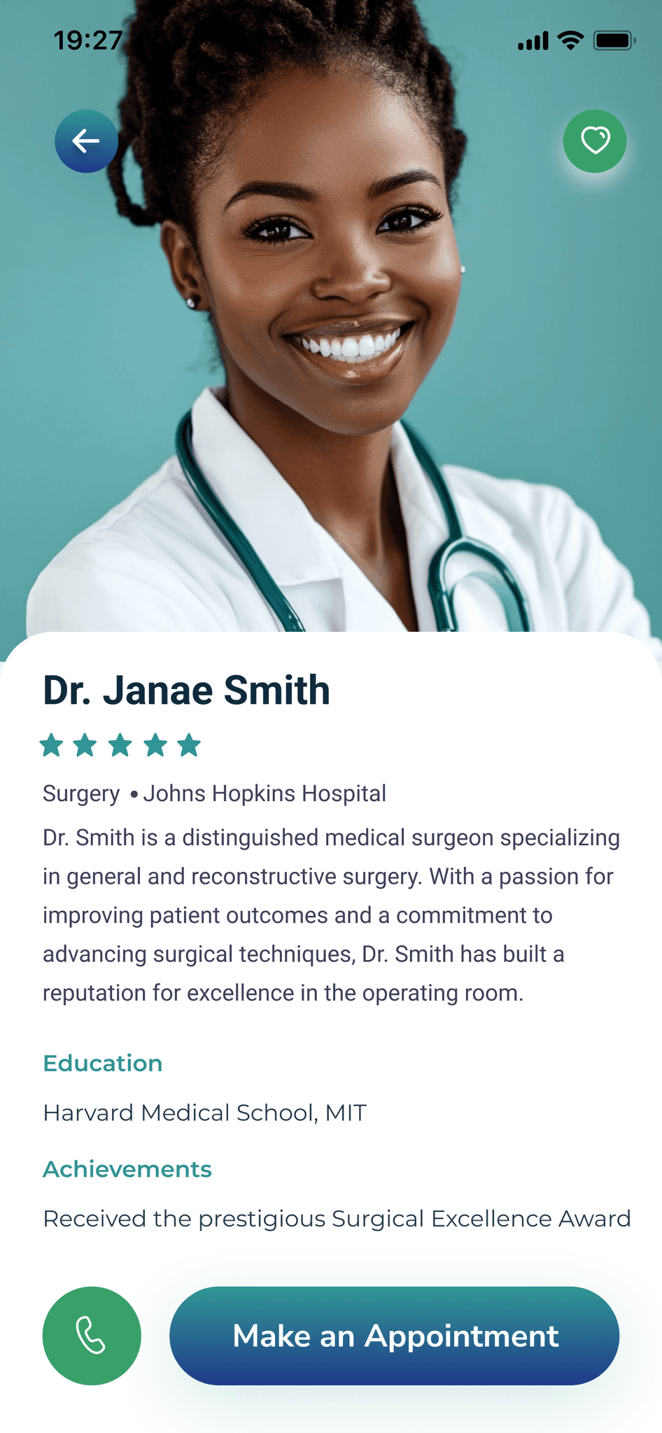
The Final Product
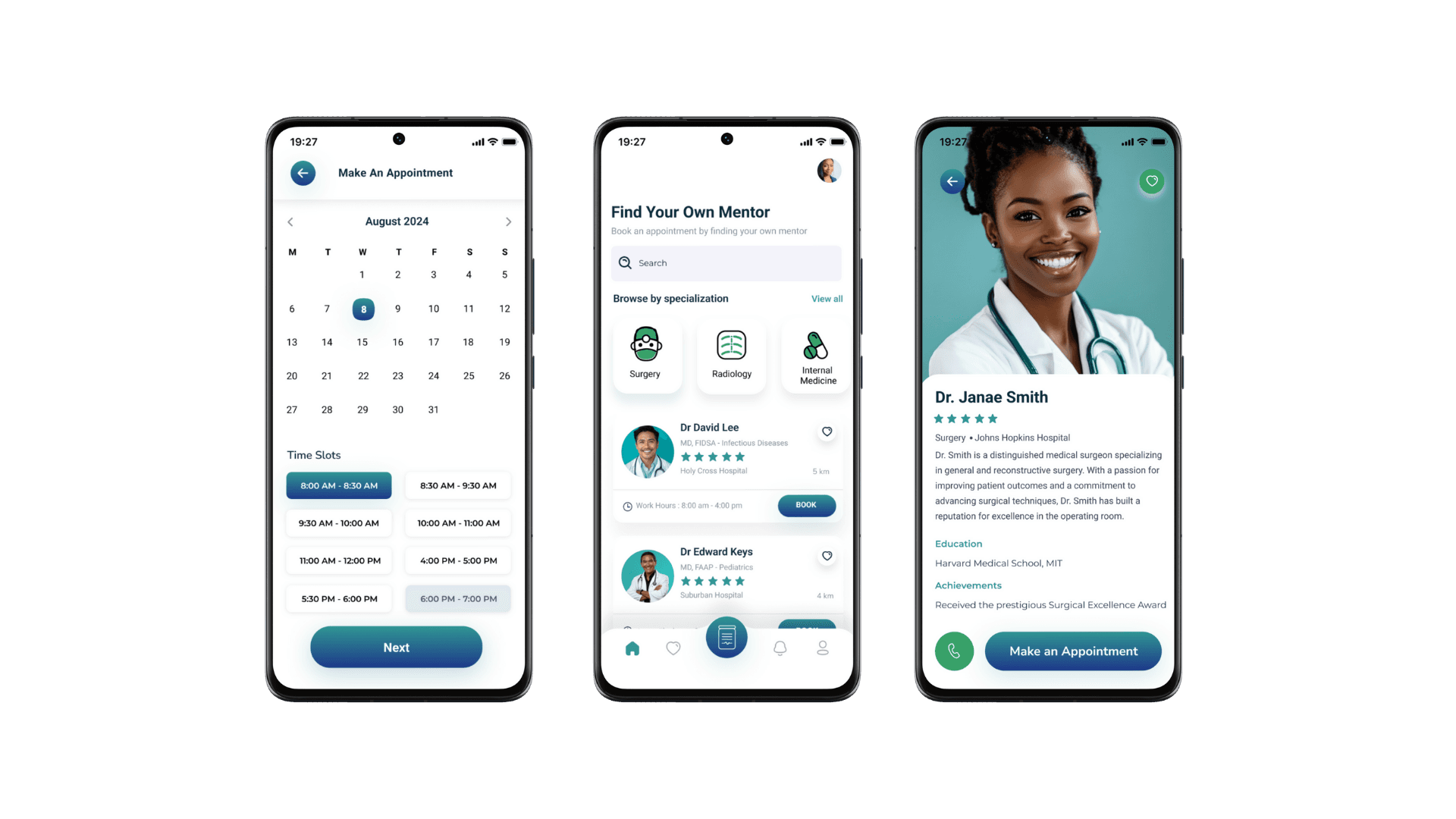
Reflection + Next Steps
Working on the More White Coats app has been a deeply personal and fulfilling experience. I’m passionate about creating a platform that empowers underrepresented students in the medical field because I know how much representation and guidance matter in shaping careers.
Seeing how users interacted with the app during testing opened my eyes to the challenges they face and the importance of making this tool as accessible and intuitive as possible. After hearing feedback about the complexity for new users, I felt even more driven to ensure the experience is welcoming and supportive from the start.
The next steps when it comes to enhancing this design even more are...
📈Progress Tracking and Goal Setting:
Add features where users can set milestones for their medical journey and track their progress.
🤝Peer Support Communities:
Implement chatrooms or forums for users to connect with other aspiring medical professionals.
📢Scholarship Notifications and Alerts:
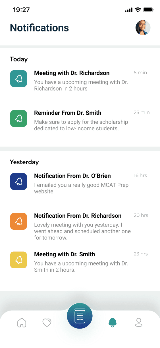
Provide real-time updates and alerts about relevant scholarship opportunities.
Check out more of my case studies!